WHEN CONTENT NEEDS A PROPER MOULD
The Challenge
Glitter Lab is not only a family artistic studio, but most of all, a team which makes even the most sophisticated glass pieces of art. Apart from classic round baubles, in Glitter Lab you’ll find fantastic gryphons, gold-scaled-dragons, and Fabergé eggs.
The company found favour not only with domestic market but mostly with the United States where Glitter Lab sell a substantial part of their collections. The products find their way to world-class fashion houses and department stores.
Due to COVID-19 pandemic the company lost their chance to take part in fair trades which used to be the main channel of leads. The management decided to refresh the website because the old one wasn’t designed to inspire trust in the clients Glitter lab targeted.
The concerns the company had at our first meeting:
- Products of Glitter Lab are outcomes of hard creative work. Can a website show how much effort their production requires?
- Do we get to intrigue creators and private collectors ser Glitter Lab as an interesting and worthwhile brand?
- Can photos show products’ uniqueness and top quality?
- How to persuade a potential client that the creative process tends to be unpredictable, yet the outcome is worth its price?
When Glitter Lab decided to take the challenge, we helped them create a website that in itself is a small piece of art – sophisticated, elegant, and most of all – speaks to emotions of potential clients.
THE FORMING OF THE PROJECT
The Approach
We knew from the start that this project would be demanding. Enough to say that we had to coordinate the preparation of all resources essential for the realization of the project – graphics concept, photos that match the concept, and copywriting to fulfill the brand communication.
Keeping in mind how the Glitter Lab team was swamped with daily work, we decided to devote as much time as possible at the beginning to understand the needs and objectives of our client. It helped us to lead the way forward and propose a new brand style that eventually set the tone for further photo shoot.
Then, we could proactively support the client in creating the script for the photo shoot, finding the right photographer, and consulting the details of the photos. This way Glitter Lab could focus on building a full product catalog, and tagging all products, which was necessary for further advanced filtering and sorting.
The project was formed in given steps
Discovery Workshop with our UX Designers with the goal to discuss company’s and targeted clients’ profiles. The outcome of the workshop was a clear map of problems to address followed by a list of recommendations how to overcome each one.
SEO analysis and keywords research – the base for positioning Glitter Lab on the US market.
Architecture and the logic of the website that are supposed to lead the client by the hand, showcasing the products and the production process. This step resulted in site mock-ups prepared in Adobe XD. We also chose the new brand colors as well as the leading fonts.
A series of meetings with the copywriter to focus on the company’s story and values. We decided to emphasize an amazing eye for details of Glitter Lab’s artists, as well as rich embroidery of their products. The copy, of course, was to match the communication concept.
Gradual design of following subpages which we regularly discussed with the client. On parallel, we managed the photo shoot of cherry picked products.
Development of the website and server configuration so that the new website is secured and optimized for the US market.
Regular status meetings within the Wise People team kept us all updated and focused. We were able to present the results on a regular basis, even though the entire team worked remotely throughout the entire project.
How does Glitter Lab website look now?
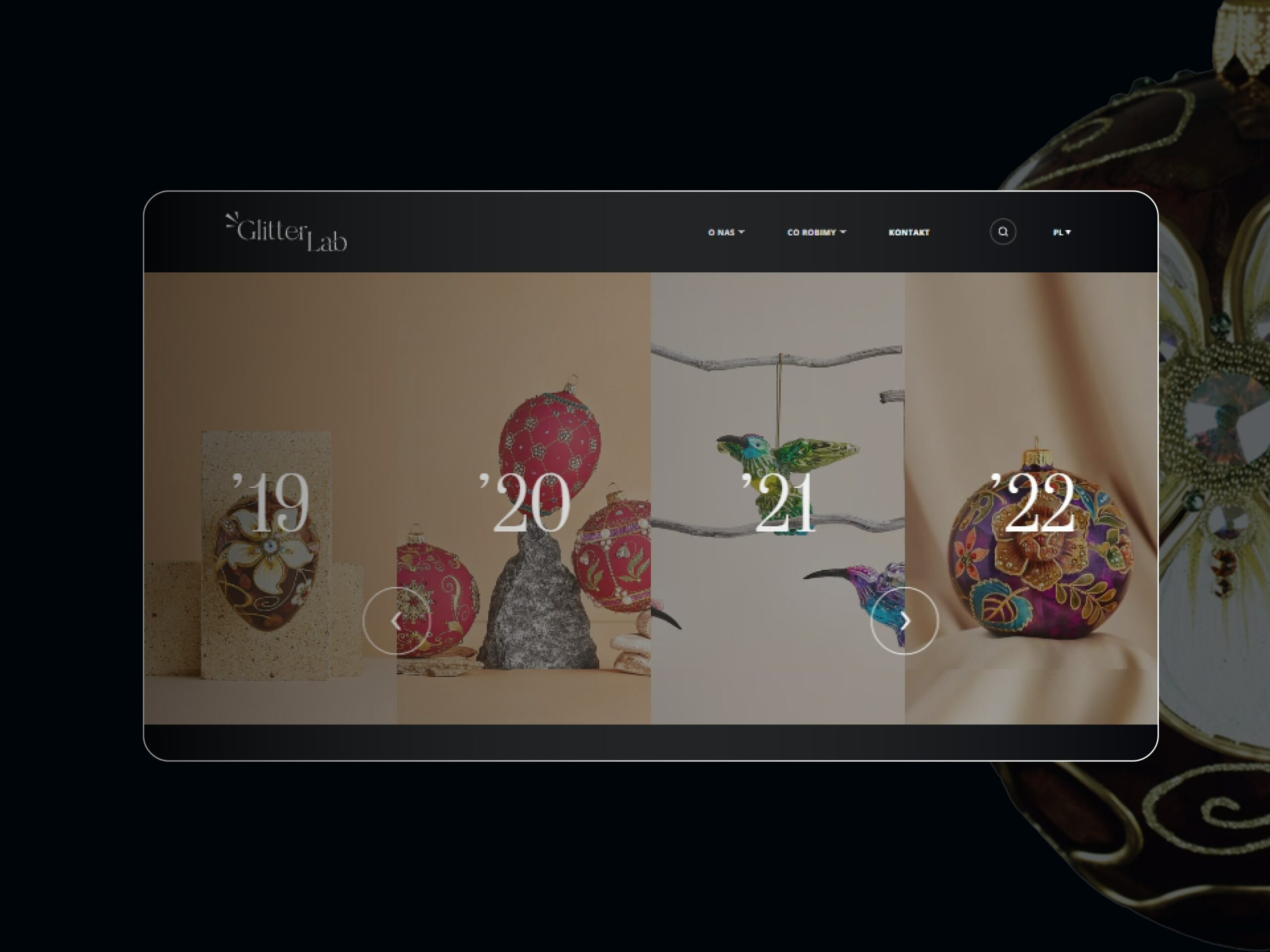
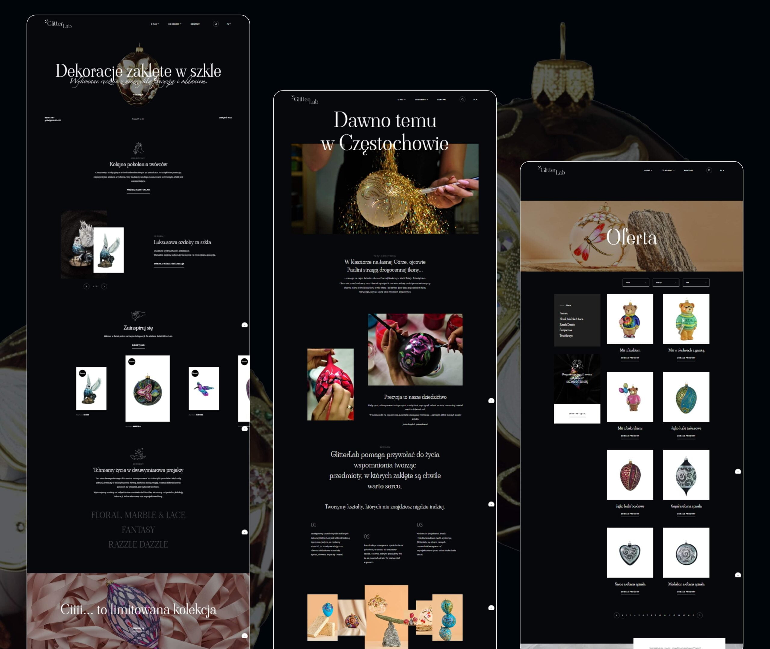
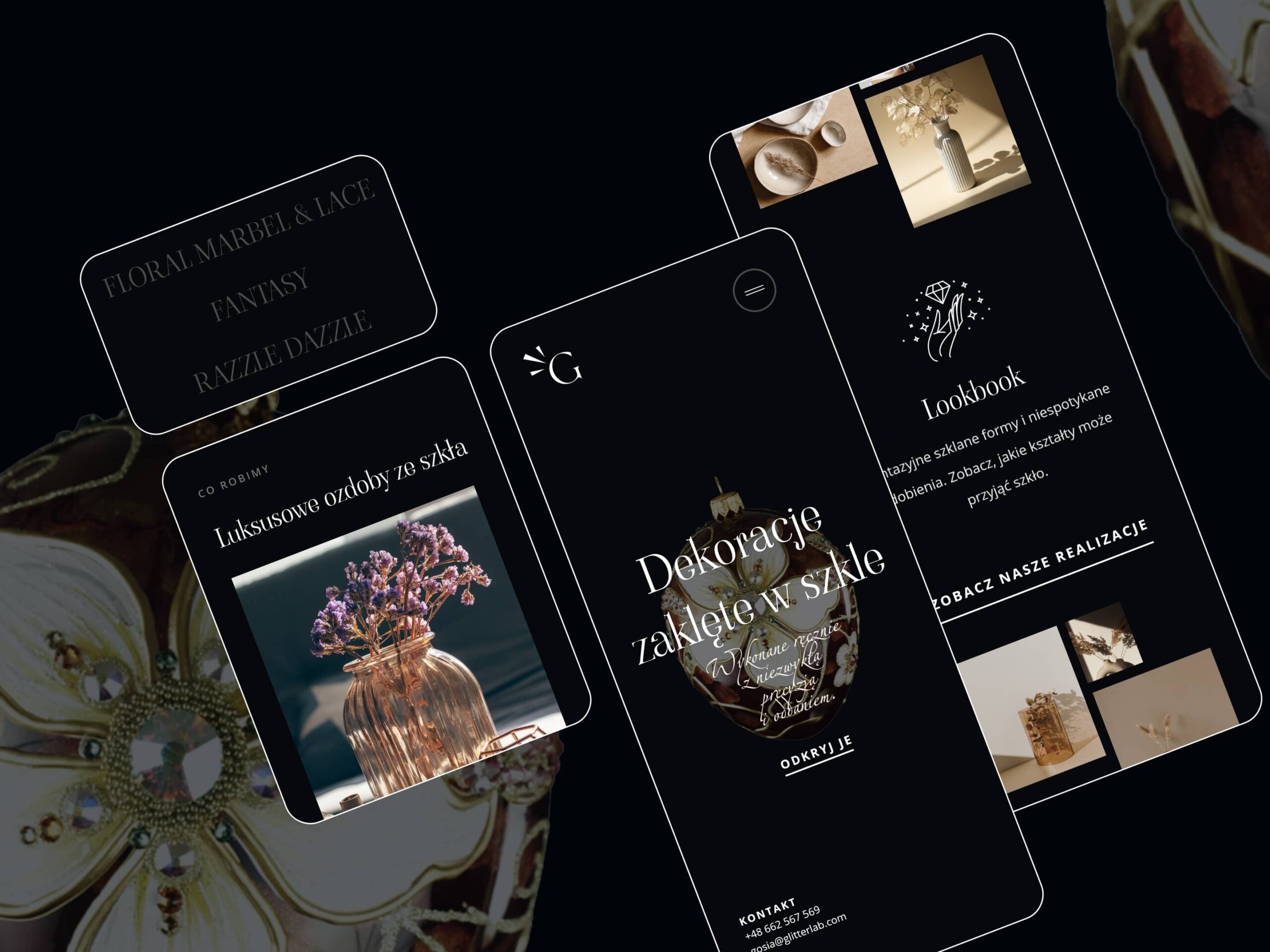
- Rich in photos yet still fluid in reception, the new website shows the portfolio of the company and a sneak peek of how artisans make 3D glass ornaments.
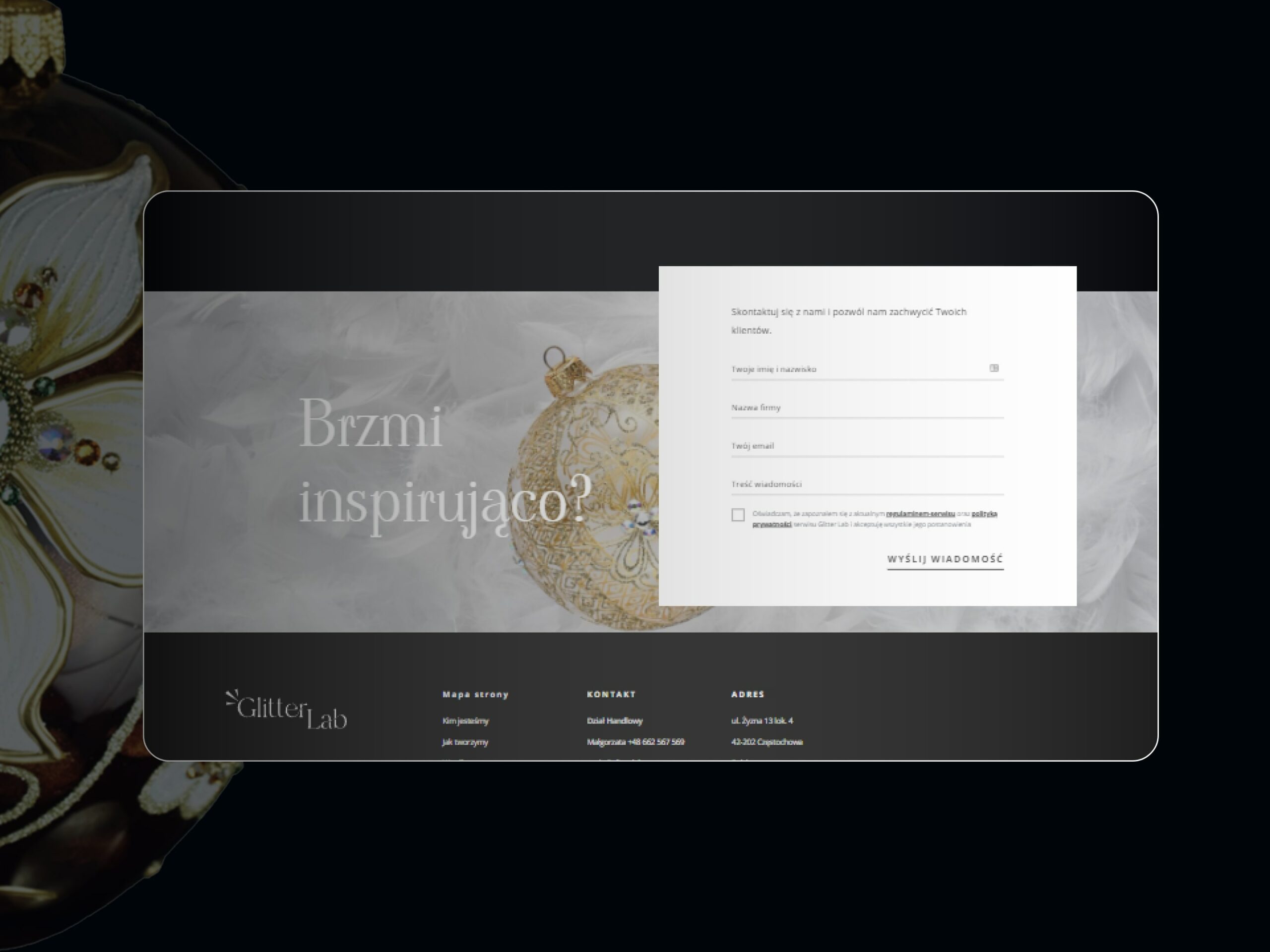
- The dark background of the template combined with an extravagant font point out that Glitter Lab targets its work to clients with the sense of art.
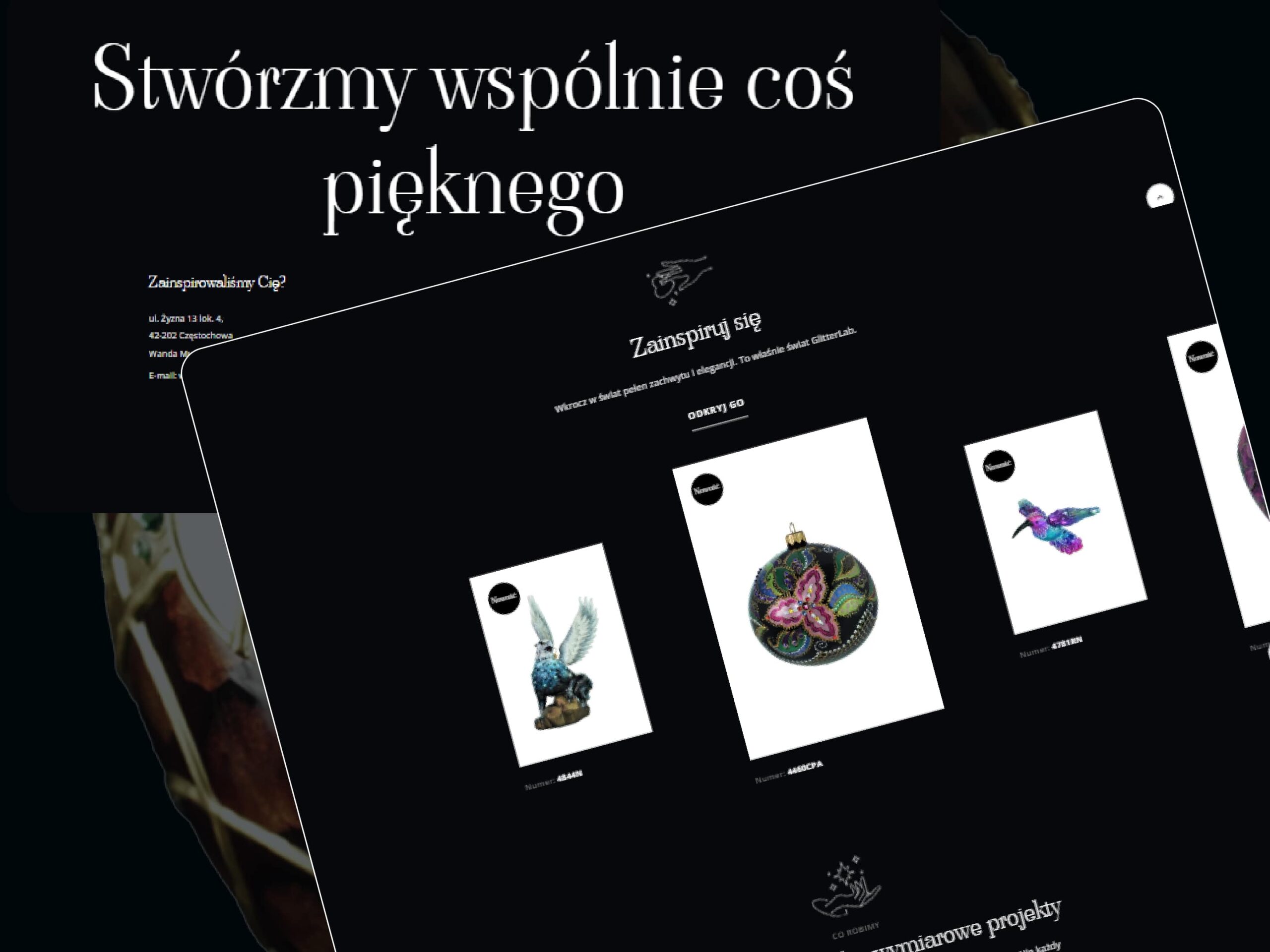
- Fluid design full of finished products make the user dive into Glitter Lab portfolio.
- Pack shot photos clearly cut themselves out of the black background showing the richness of embroidery and shapes.
- A professional photo shoot was fruitful with offbeat product shots that consistently intertwine with plain product photos.
- WordPress engine gives our client the freedom to edit the page, and full control over the copy.
- WPML makes it easy to switch between language versions.
- The Yoast SEO plugin supports the site positioning and content optimization.
- Products became a special post category which allows site administrators to edit them from the WordPress panel.
- Displaying the information about product categories as well as filtering don’t require an API connection, which significantly takes the load from the server.
- Advanced product browser allows the user to dynamically filter the products by several conditions.
- Custom designed fields in the project description fill in automatically which prevents the client from filling in the collection description every time a new product is added.
