What did the Recepty24 portal need?
The challenge
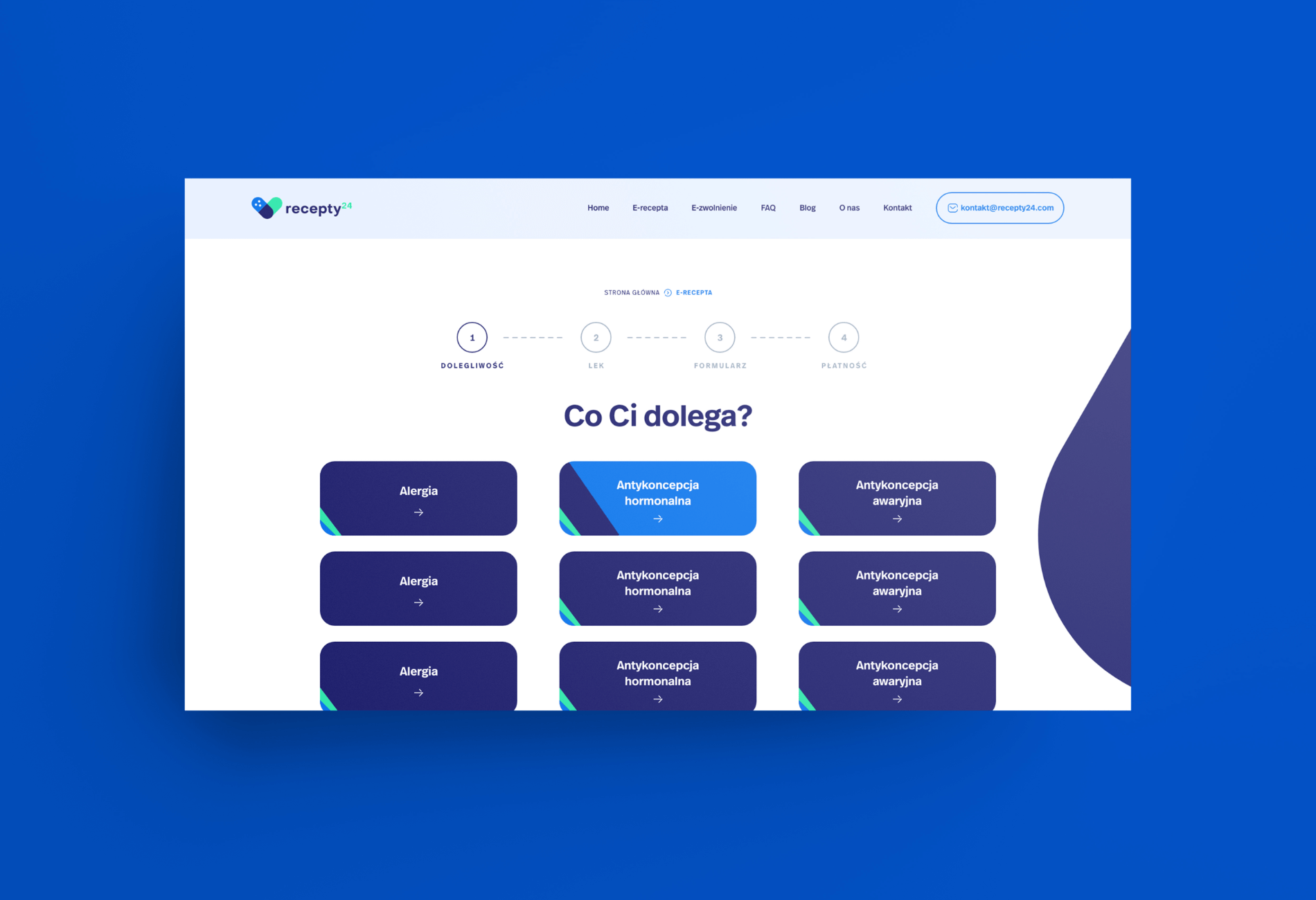
According to UX guidelines, the user’s path from entering the website to achieving the intended goal should be pleasant and problem-free. However, in this case, we could not simplify the forms that collect data about the user, because they play the role of a medical interview.
Key assumptions:
- The website is to generate trust.
- The forms must comply with the GDPR and other legal regulations, including medical ones.
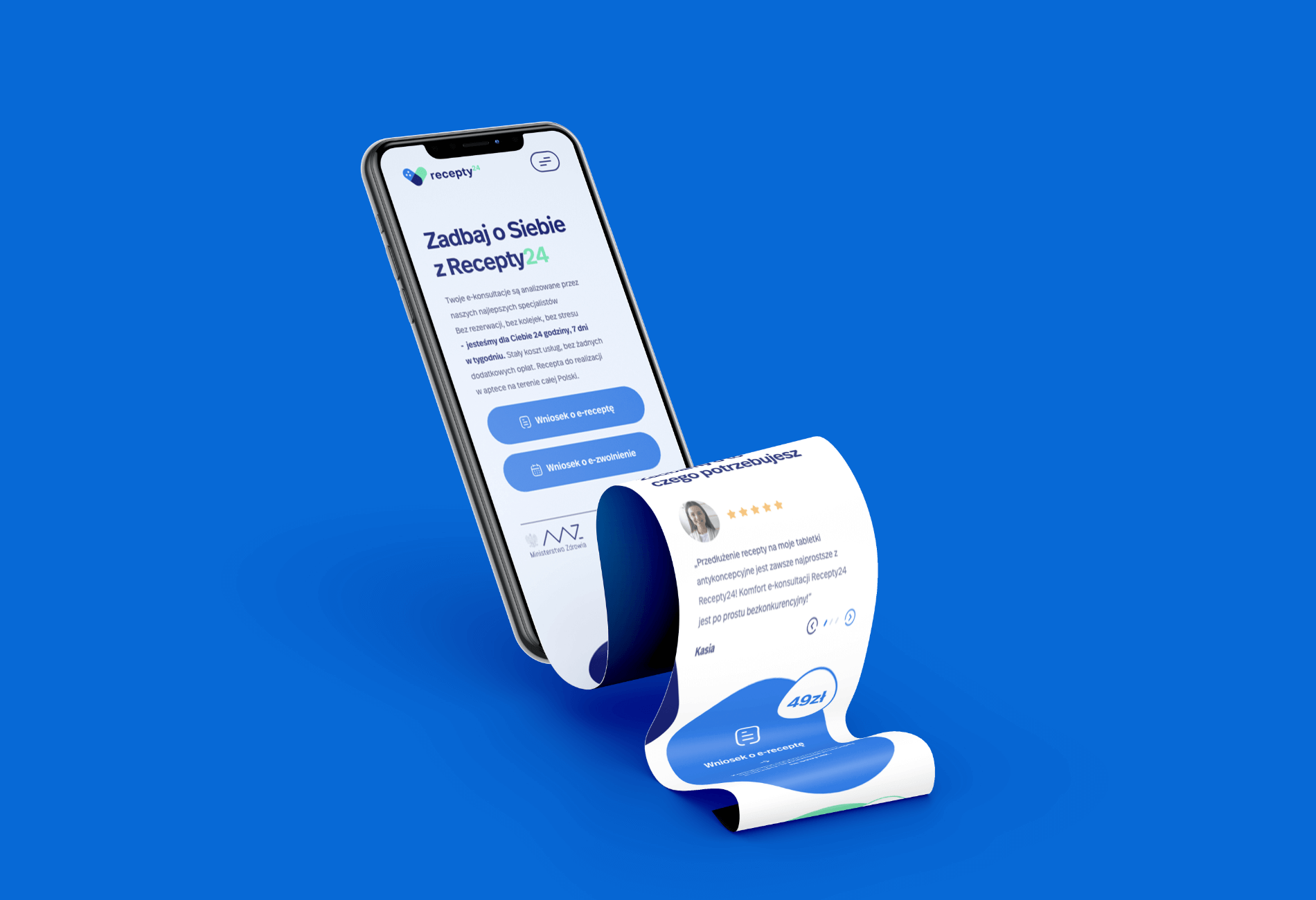
- Forms need to be displayed properly across all types of devices.
especially on mobile devices. - www must be integrated with the payment and invoicing module.
It was quite a challenge to create a customer path so that the amount of information required by the law did not seem overwhelming. This has been achieved with the help of design, well-designed forms and copywriting that dispels users’ concerns already on the home page – Q&A and slogans that explain how the portal works.
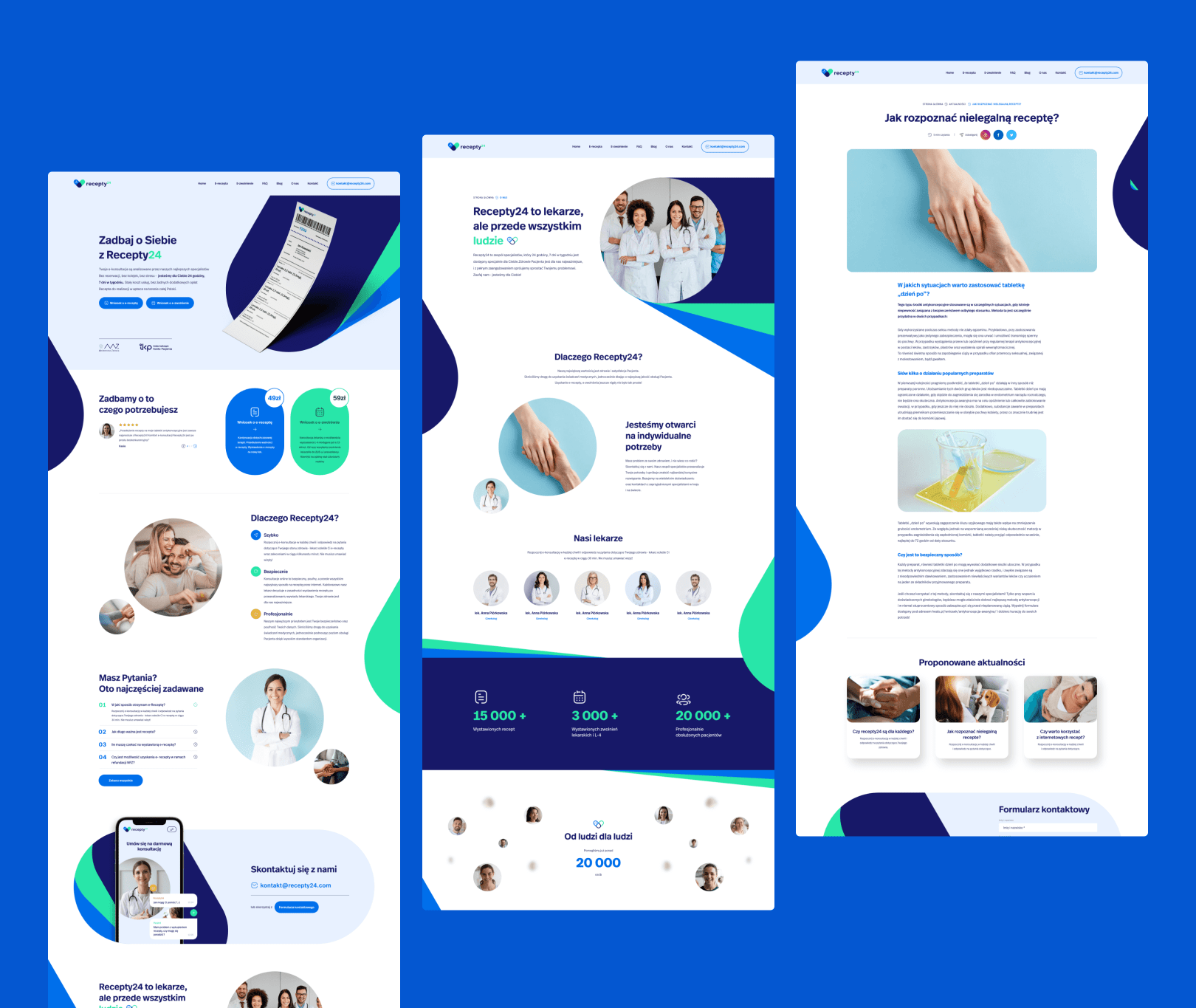
How we approached the issue
The approach
One of the things that had to be done at the very beginning was selecting the target group. It was an interesting experience because it showed us how many people the portal will help. For example, people who are permanently registered in a place other than the one in which they live – are not assigned to a family doctor or suffer from embarrassing diseases.
Recepty24 is also a simplification for adult sons or daughters caring for their parents from a distance.
Very often, elderly people go to the doctor only to write out a prescription for soon-ending medications. If they are still in good shape, they will do it on their own. But if they have mobility problems and their children are far away or cannot leave work to take their parents (or grandparents) to the clinic, the problem becomes a struggle for life.
Steps in the project:
- Discovery Workshop to confirm initial project assumptions.
- Determining the visual issues – the portal’s design, apart from transparency, had to stay ahead of trends in order to stay ahead of the competition.
- Approval of the home page and logo, and then individual subpages – in terms of appearance, content and functionality.
- Collecting all technical data, including those related to legal regulations.
- Website testing, including whether the payment gateway is working properly.
- Transferring the website from the test environment to the target server.
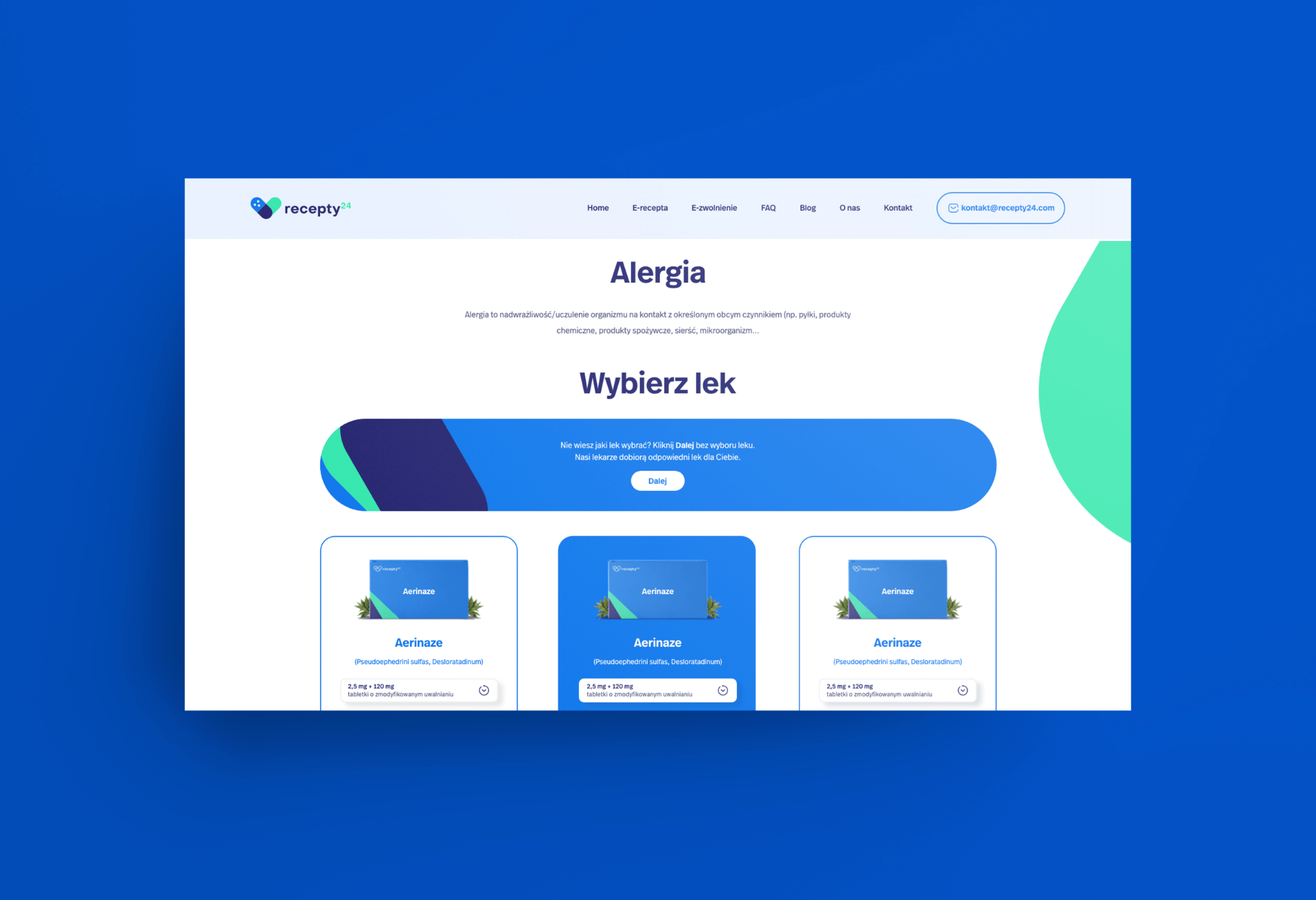
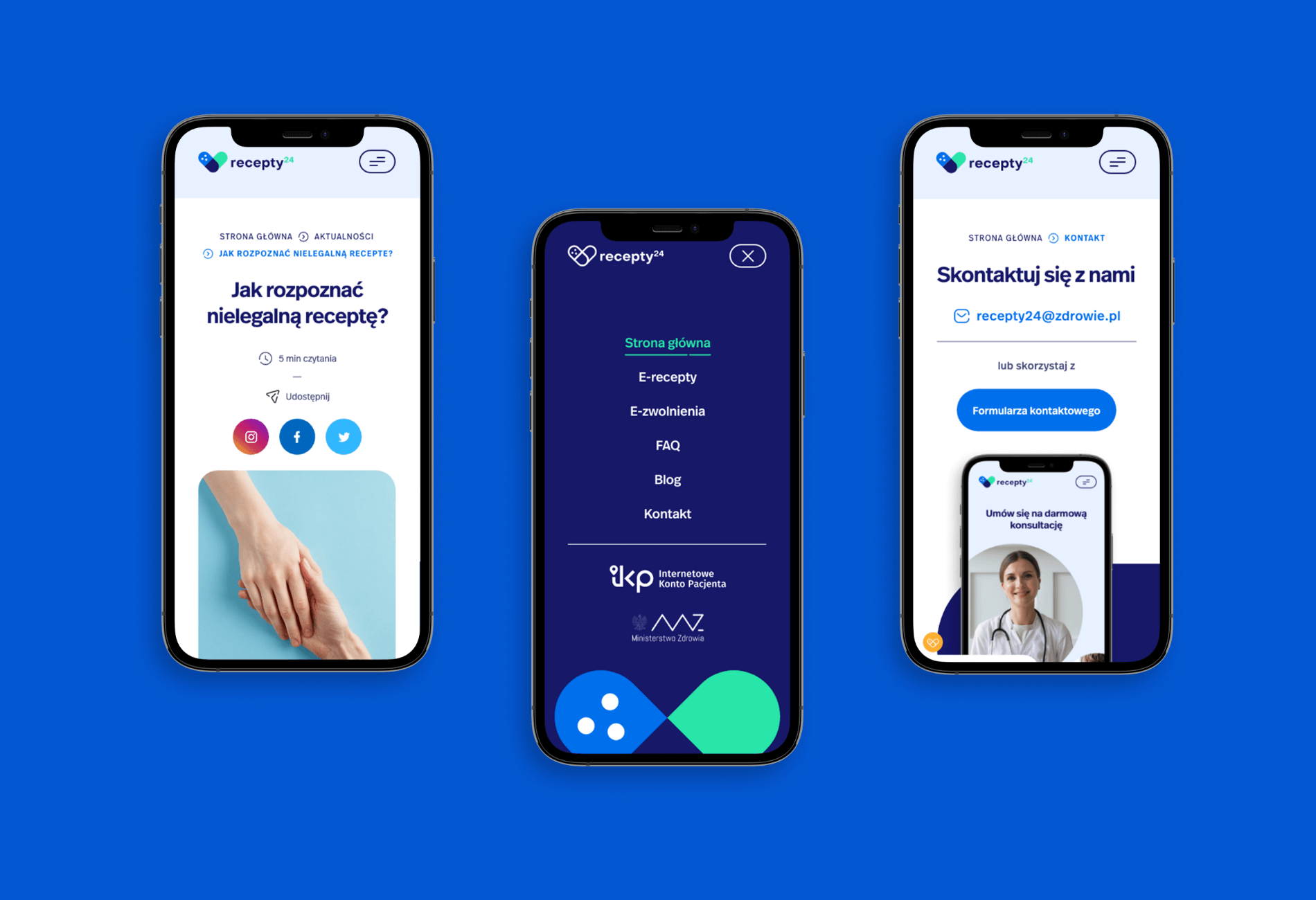
Recepty24 is proof that digitization of services can be carried out with safety and without compromising the quality of service. We are glad that we could take part in this project.
Results for the Recepty24 portal
- The very appearance of the website inspires confidence.
- Light, responsive and transparent.
- Extensive forms with a wide catalog of questions and division into categories help to automate long-term processes.
- Integration with payment gateway and invoicing.
- Advertising materials – e.g. forms for creating graphics in social media.
