What did Scaneye need?
The Chalenge
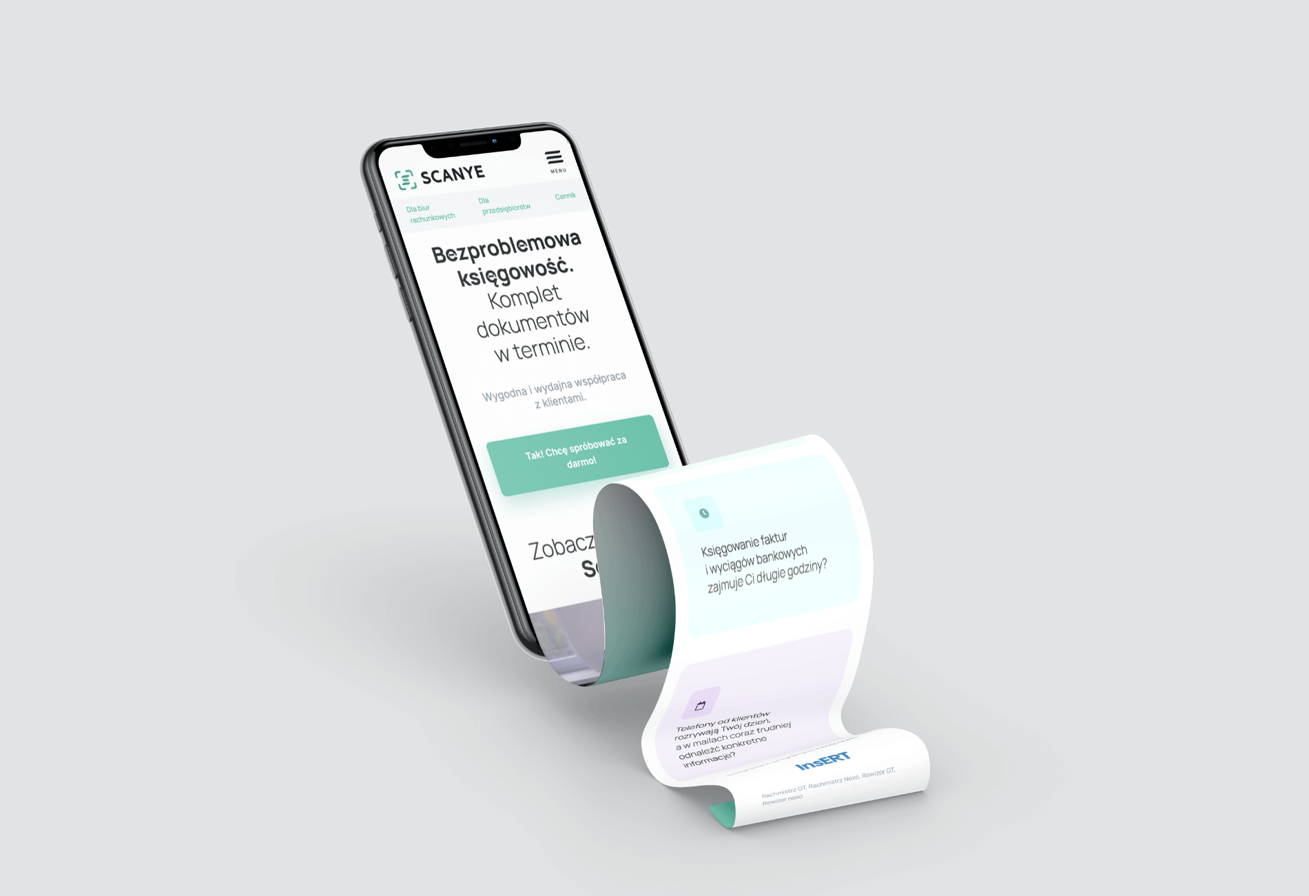
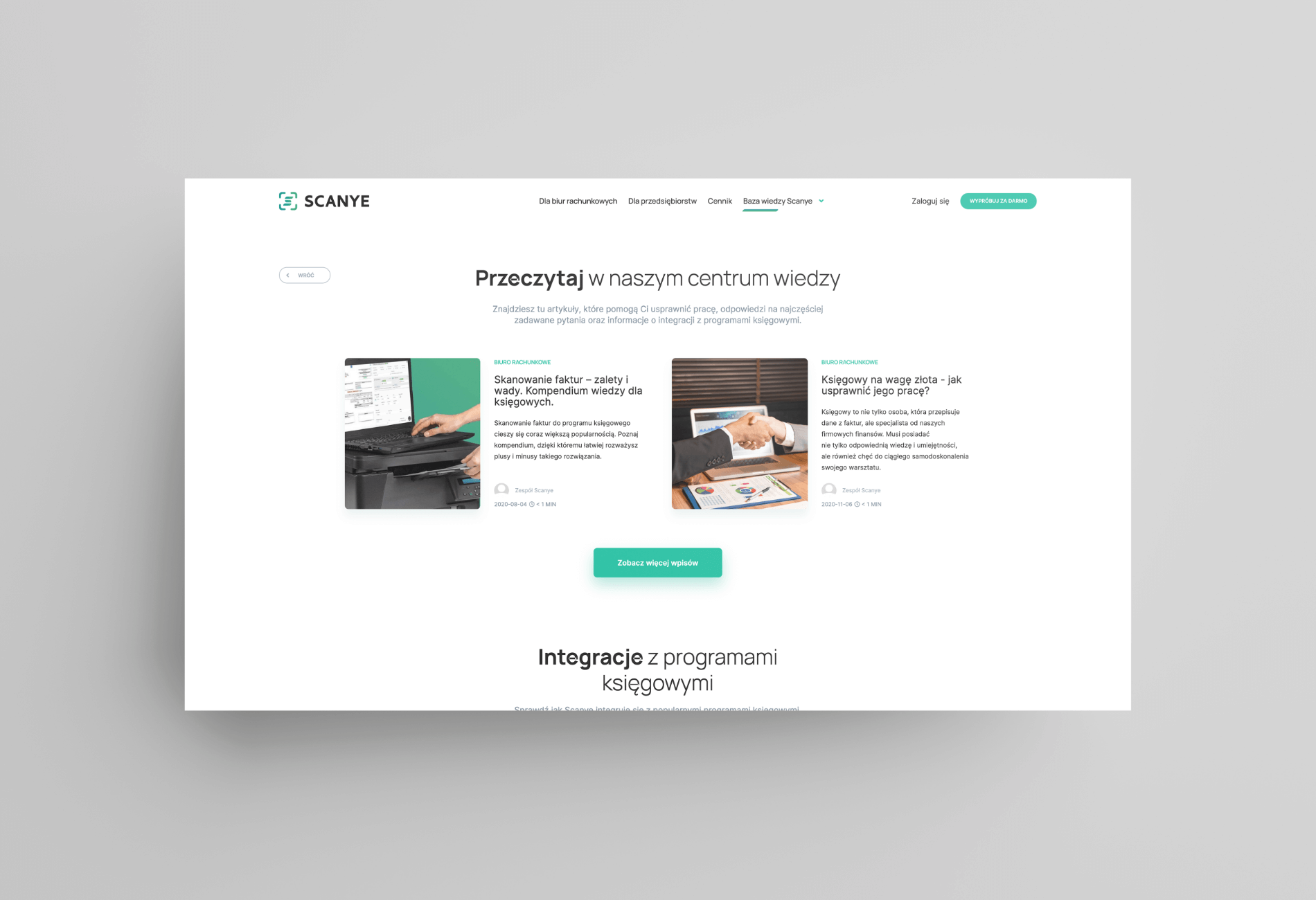
Scanye takes the stress off the shoulders of entrepreneurs and accountants, because it facilitates the circulation of documents between the accounting office and the company. The brand decided to fight for an increase in the number of users with a new website.
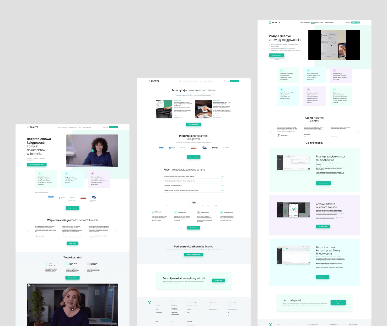
Our task was to refresh the first informative version of the website promoting the application for accountants – Scanye. A lot has changed since the application entered the market. It was necessary e to update the history of the brand and emphasize the benefits for users.
Communication was a challenge. During the project, we cooperated with several agencies and a changing team on the customer’s side. Two marketing managers (one after the other), a product manager and a UX designer were responsible for the project, as well as external agencies that supported the project in the area of SEO. We had to unify all ideas and visions.
To deliver the project, we made the following assumptions:
- The website is to support a dynamically growing start-up.
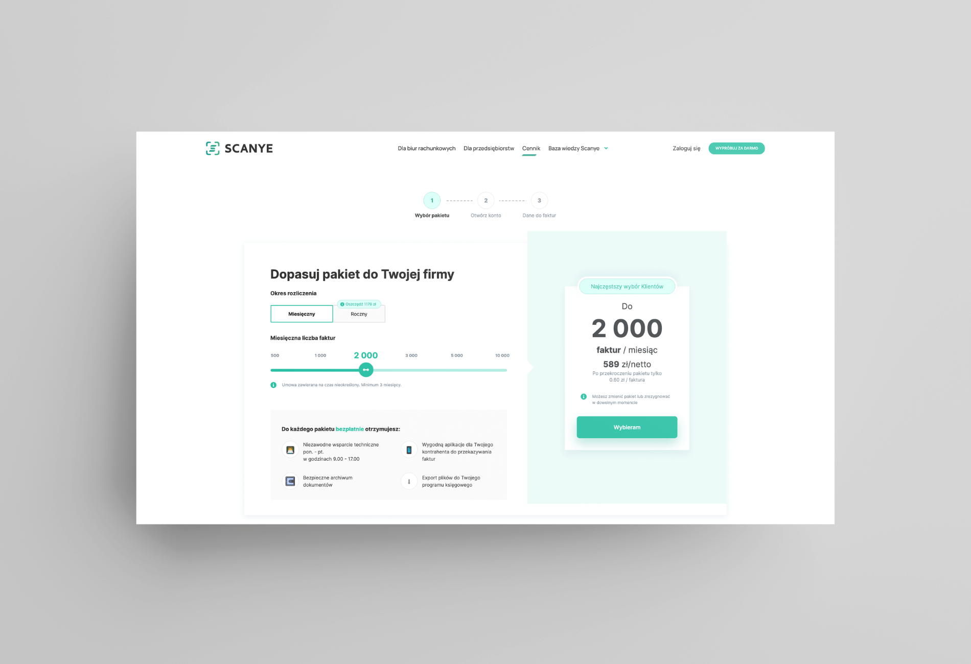
- The price list module integrated with the application should look and function the same on the website and in the application.
- The website is to increase interest in the product, acquire new customers, build awareness and increase the company’s credibility, as well as emphasize the benefits of the Scanye application.
Accounting issues are important, but how to make them interesting for users as well?
How we approached the issue
The approach
We started working on Scanye because we had previously designed and tested a new application interface for the same brand. As a result, we had knowledge directly from users, which is important for them when using Scanye. We designed a new website based on their needs.
Steps in the project:
- Discussion of the project, scope of work, ideas, concepts, goals.
- We met once a week to specify what we need from each other.
- Design. After presenting the concept, the designer created previews that we discussed together. Together, we tried to find the best solutions for presenting the content.
- Development. It was intertwined with other stages.
- Implementation – we used many solutions: ACF fields to edit the content of the project, React modules for dynamic views in the project, lazy loading of photos to optimize the project, implementation of a slick slider for elements using a carousel.
We coded the accepted views flexibly, not sequentially, because that was the most convenient way in this project. Thanks to this, all elements came out very coherently.
Results for the Scanye brand:
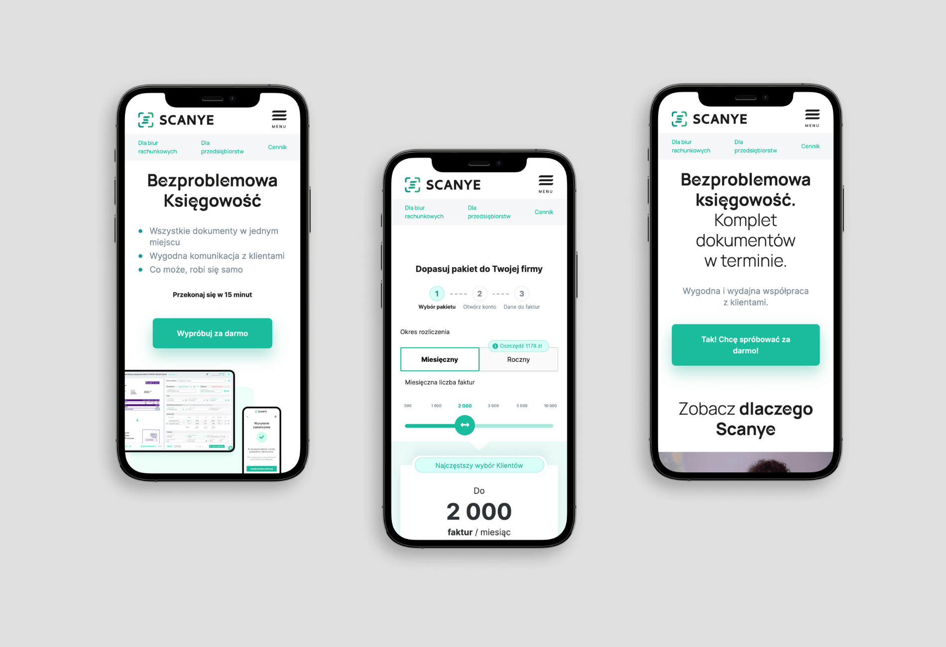
- New website presenting the product.
- Consistent communication of the product and benefits of use.
- Price list module integrated with the website and application.
- Drawing interest of the recipient and increasing interest in the product.
After the end of the project, we continue to stay in touch. For us, it is a confirmation that the customer liked the Wise People style of work and the quality of design.
