The Challenge: digital had to reflect the brand’s true standing
For Tarasola, the starting point was never brand recognition. Over the years, the company established a name that, for many customers, became synonymous with modern patio canopies. Our challenge came from a market-defining brand with an extensive product portfolio, diverse audience segments, and multiple sales models.
The previous website failed to reflect this scale. The new platform had to establish a premium presence, showcase products in alignment with their high-end industrial design, and guide every user to the right solution.
A homeowner looking for a backyard pergola has entirely different needs than an architect, developer, restaurateur, or prospective distributor. That is why we didn’t start the design process with screens.
The Strategy: UX Research and Discovery First
Before diving into UX/UI design, we ran Discovery workshops and in-depth user research using IDI (in-depth interviews). We spoke with Tarasola’s clients, the sales team, and business partners.
Our goal was to understand not just what users look for on the website, but what their actual decision-making process looks like: what information is required at each stage, where friction occurs, what questions are most frequently asked, and how journeys vary across target audiences.
We leveraged our research findings to craft the information architecture, shape the product presentation, and map out critical user flows. Throughout the project, we also consulted and refined copy through UX writing.
One of the pivotal strategic decisions was clearly separating two core purchasing contexts. For individual consumers (B2C), we designed an inspiring, product-focused path centered on tailoring solutions to specific living spaces and requesting a custom quote. In contrast, the dedicated B2B environment caters directly to distributors, architects, commercial developers, and the HoReCa industry.
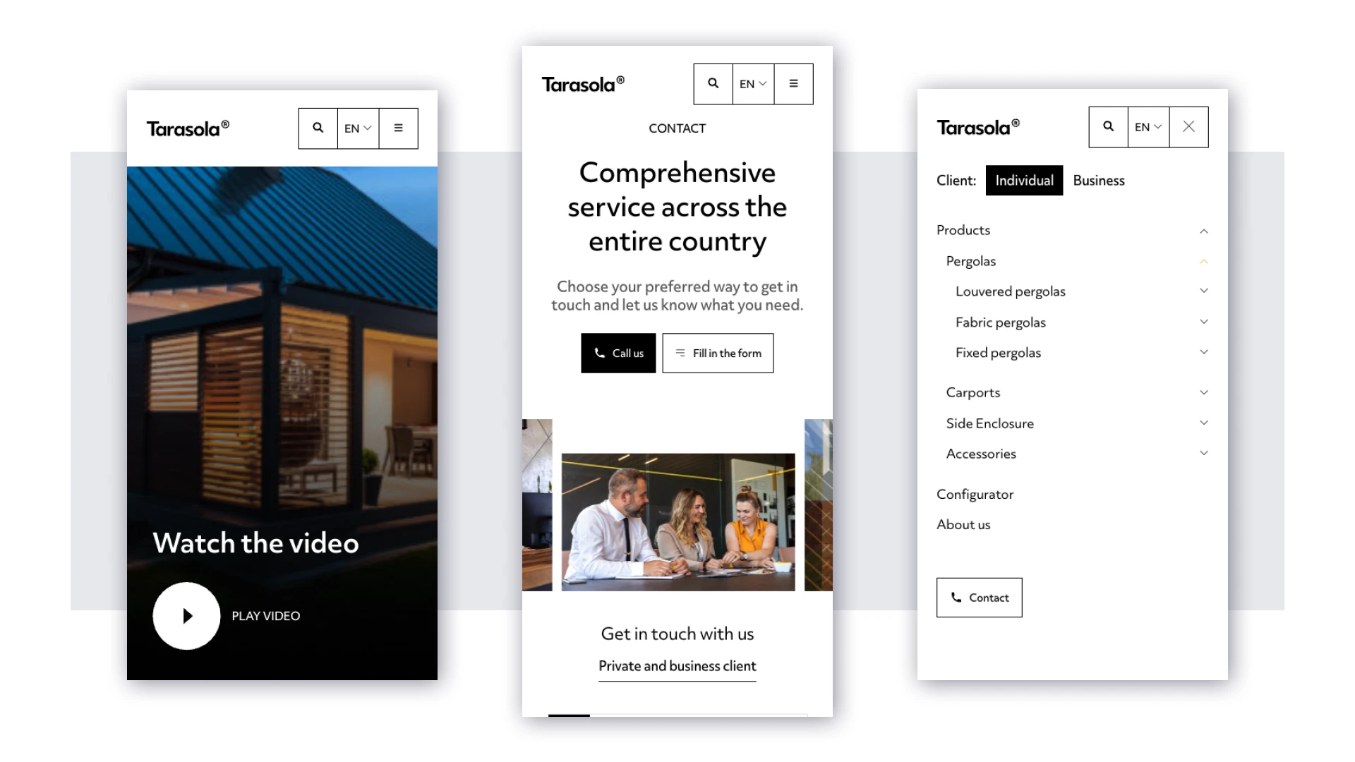
By taking this approach, we avoided forcing a single interface and one unified tone onto audiences with entirely different business requirements. A comprehensive mega menu organizes Tarasola’s expansive catalog, allowing users to quickly navigate categories, individual models, accessories, case studies, and tailored content per target group.
Przemysław Zagził, UX/UI Designer Wise People
The Result: a premium product in its rightful digital home
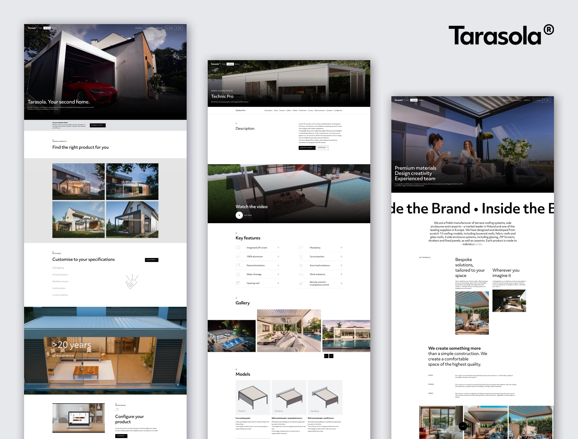
In the visual layer, we prioritized open space, high-resolution photography, video assets, and scroll-triggered animations. Movement, wide framing, and depth-of-field translate the essence of the physical product—architecture, space, and outdoor living—into the digital realm.
Behind the striking front-end lies a robust information architecture, distinct B2C and B2B journeys, an intuitive mega menu, and purposeful user guidance from inspiration and product discovery straight to configuration and RFQ (request for quotation).
The outcome is a digital platform that reflects Tarasola’s industry leadership and serves as a hard-working engine for marketing and sales. Furthermore, launch day did not mark the end of our partnership. Through ongoing technical support and maintenance, we continue to evolve Tarasola’s digital ecosystem alongside their expanding product catalog and emerging business goals.
FAQ
Curious about what goes into designing a digital platform for a premium brand? Below, we answer the most common questions regarding the role of UX research, separating B2B and B2C user journeys, and balancing striking visual design with measurable business results.
UX research grounds design decisions in genuine user needs rather than internal team assumptions. For Tarasola, we used IDI interviews with customers, partners, and sales reps to uncover the real decision-making process, identify drop-off points, and map the differences between B2C and B2B buying behavior.
In B2B, sales cycles are longer, involve multiple decision-makers, and require detailed product specifications, commercial terms, and partner assets. Designing dedicated, isolated experiences for each audience delivers significantly higher conversion than trying to build a single, one-size-fits-all path.
The key lies in a well-structured information architecture, logical categorization, intuitive navigation, and unambiguous discovery paths. For large portfolios, solutions like mega menus, multi-faceted filtering, interactive configurators, and audience-tailored landing pages keep the interface clear and usable.
Yes. Animations, video backgrounds, and scroll interactions should elevate the brand identity without introducing lag or obscuring key content. Great design balances visual impact with high performance, semantic structure, and frictionless conversion paths.
Wise People’s Discovery process aligns business objectives, audience expectations, sales requirements, technical constraints, and long-term roadmaps. As a result, subsequent UX/UI design and engineering decisions stem directly from verified business priorities rather than subjective aesthetic choices.
- Yes, when structured around the customer journey. A strategically designed platform preempts common customer questions, clarifies options, aids in product selection, qualifies incoming leads, and routes potential buyers seamlessly to sales representatives or tailored quote requests.