Experience, top qualifications, a rich offer and an attractive location are the values that are definitely worth conveying to potential customers. Blikpol eye clinic from Sopot realized how much could be gained with a customised website, however, was in need of the right contractor. And this is where we came in with our creative workshop, design and development.
An experienced company aware of its digital needs
- Blikpol Ophthalmology Center is located in Sopot, on the second floor of the famous Krzywy Domek (Crooked House).
- The clinic provides specialized ophthalmic services, including laser vision correction, dry eye syndrome treatment and corneal cone therapy.
- Blikpol team is made up of experienced specialists and a team that guarantees comprehensive care and service.
- The brand key strengths include: a highly competent team, the equipment, a wide range of services and location.
How to build an image with business in mind?
The activities related to the design and the implementation of the site were preceded by a discovery workshop, where we focused on both: maximizing the conversion (business aspect) and building as much trust in the brand as possible (image aspect).
Among other things, the success of the project was defined by an increase of visitors’ engagement in the website. We optimised the contact paths, structured the information, and made it easier to reach the desired information in a shorter time. The site was also simplified (while maintaining its substantive character).
Marcin Trojanowski, Project Manager at Wise People
The ophthalmic treatments offered by Blikpol are all about health. They are serious expenses that need to be thought through in a given time frame. Therefore, there is a good chance that a potential customer will return to the site many times before the decision to make an appointment, for a specific purpose, is finally taken.
Understanding the customer’s perspective should always be a standard procedure at the planning and designing stage of a company website, so it was natural that we already talked about the target groups during the discovery workshop. Thanks to the Bulls Eye Diagram method, we were able to categorise the customers and identify their key needs.
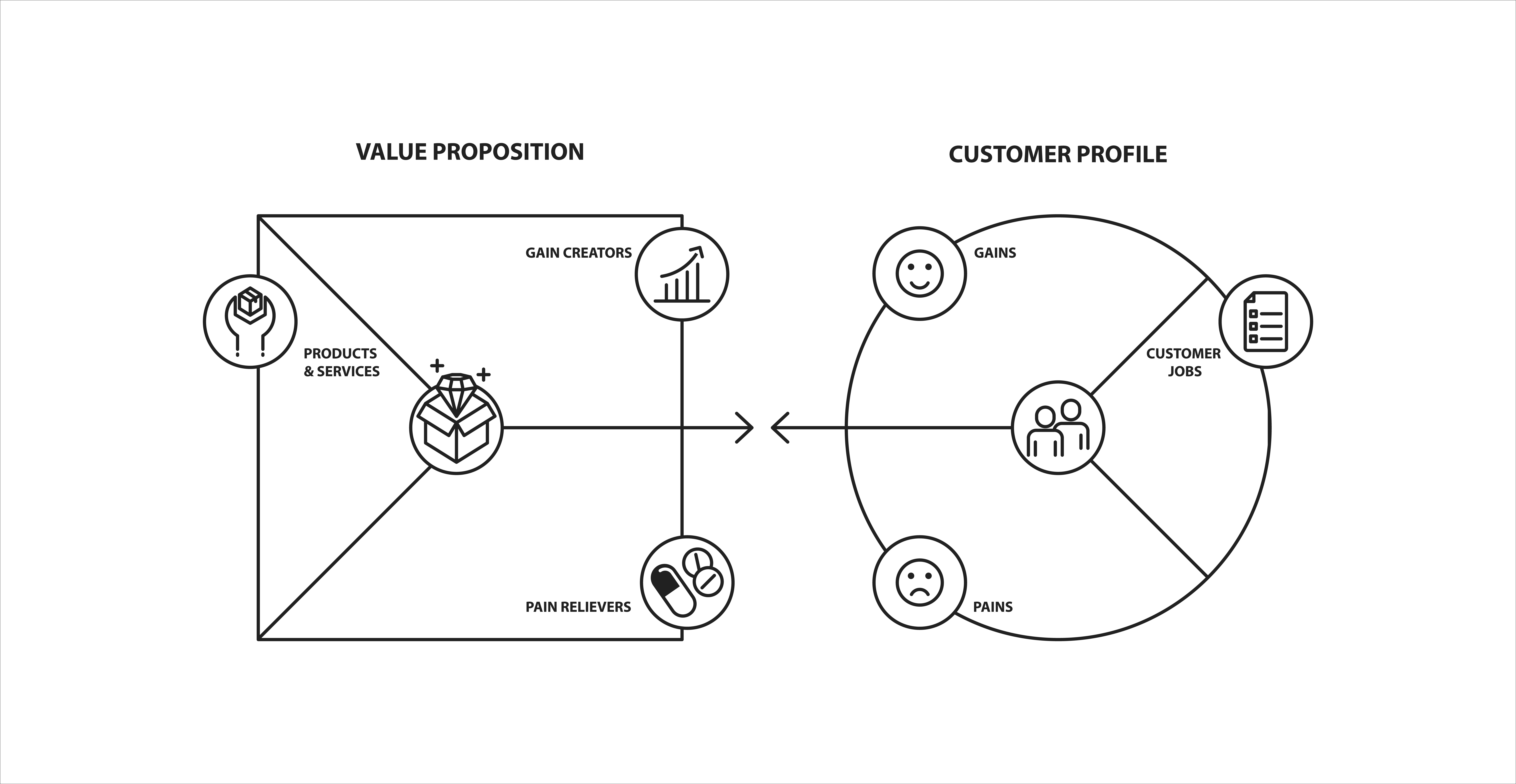
Wise People workshop with Blikpol representatives also made it possible to establish a proposition of values – here, as usual, a tool, which is worth recommending, is the Value Proposition Canvas.

Eye treatments at Blikpol clinic may be of interest not only to people who are tired of using lenses and glasses. The reasons for this may vary, for example, the fact that good eyesight is fundamental for a particular job.
Marcin Trojanowski, Project Manager at Wise People
Ophthalmic procedures – can they be shown in an attractive way?
Blikpol provides many specialized treatments – from laser vision correction, premium lens implantation, to surgery and aesthetic medicine. On top of that, what should be mentioned are the examinations – their offer is extensive and requires adequate exposure. Another issue is content marketing – on the website, the patients can find many articles and the brand takes care of online visibility effectively.
The desire or simply the need to fill a site in with content is always an important starting point for a designer. The trick is to combine good UX/UI practices with the provided content, and surround it all in an aesthetic, original form.
Piotr Strzembowicz, UX/UI Designer Wise People
Blikpol positions itself as a clinic of a very high standard, which is created and run by experienced professionals. The fact of operating in the metropolitan area, as well as the specifics of the industry, is not without significance.
All these needs were included in the design we prepared.
- The sandy amber-colour scheme and wavy shapes in various sections refer directly to the location at the seaside.
- Some of the used forms may also relate to a lens or an eye.
An impressive website that is easy to run
A challenging design that breaks out of the usual patterns is a task just right for Wise People development team. We were able to implement the project at a good pace. It is important to remember, however, that at the stage of coding and implementation, any original design solution is an additional challenge.
Accessibility is a standard we pay attention to in most projects. On Blikpol website, we implemented a solution which involves simple content zooming – and that seems to be of particular importance when the site presents an offer… of an ophthalmology clinic.
Łukasz Krawczyk, Front-End Developer at Wise People
Also content marketing is essential for Blikpol. It significantly influenced the technological solutions implemented in the project.
Our client needs a site rich in content, but they also have to be able to expand it according to their future needs. One of the interesting solutions for adding the text or photos, through the built-in editor, is the possibility to introduce the “expand content” function, with practically one click in any place.
Marcin Lis, Front-End Developer at Wise People
Summary
The project has evolved over time, with subsequent alternatives, suggestions or changes (also within the executive team). High demands, but also commitment on the part of the client, effective cooperation with the SEO agency and, finally, the synergy effect of the actions undertaken by the specialists of Wise People, brought a positive result, which we are happy to share with you in this case study.
If someone is looking for quality, they will get it from Wise People team, but they should be prepared to get engaged, for example, in the initial discovery workshop. As a demanding person, I can say that the project has been satisfactory – in terms of design, implementation or the very process of reaching the final result.
Mikolaj Orchowski, Managing Director of Blikpol

