HOW TO SET ONESELF DIFFERENT AMONG TRAINING COMPANIES?
The Challenge
Falco Training & Consulting Group is a mature business focused on two industries – manufacturing and agriculture. Despite valuable workshops Falco offers support in financing as well as offbeat educational trips called #łączynasprodukcja (translation: #connected-by-production)
Falco competitive advantage is the ability to build long-lasting relationships with global companies. Meaning, they enter where external training companies are rarely invited.
Due to Covid-19 pandemic outbreak, Falco management realized that their website – an area they hadn’t paid much attention to – would become their main source of leads.
Since it was all or nothing for Falco, the company turned to the idea of building their corporate website from square one, enriched with a module of an online shop. This way, the company could distinguish themselves among old-fashioned training portals. Most of all, Falco could diversify their incomes by offering selected trainings online.
The main challenges we faced during this project:
- A strict deadline for the corporate website to go live in full version,
- Lack of benchmark – we were designing a new value for the training industry.
- Each stakeholder had a different vision regarding company communication; starting from a subtle to very confident voice.
THE FORMING OF THE PROJECT
The Approach
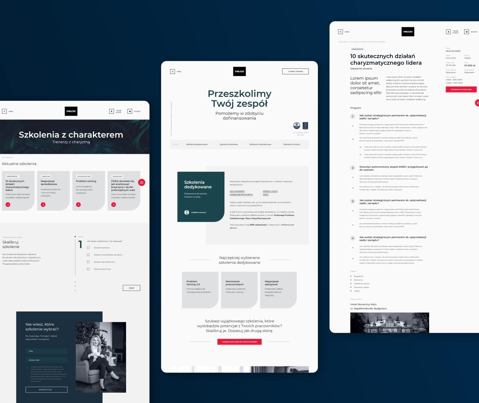
Our aim was to create a new quality of visual identity. Therefore, we took our time to prepare for the project execution. We used iterative methods and Design Thinking process to dig deep into aesthetic preferences of stakeholders. This phase resulted in two extremely different visual concepts, out of which our client chose the jungle motive.
At the same time, we were working on the usability of the website, especially of the online training creator, and the shop. The first one allowed the user to display the right training from the offer, the latter – to buy it online.
The project was executed in the following phases.
- Discovery Workshop with the UX Designers to discuss company profile and target groups. Based on the workshop, we prepared a map of challenges to address along with the ways to do it.
- Competition analysis and preparing a list of competitive advantages of Falco. It was our starting point for building company’s voice and communication.
- Architecture and logic of the website that, in a logical way, showcases a broad and varied portfolio of trainings and trainers.
- Graphic design of key subpages (colors, leading elements, fonts) made in Adobe XD. At the same time, we worked on copywriting which fulfilled the communication. All in all, at this point, we created two separate designs (both in visual and communication layer), out of which our client chose one for further development.
- Design of further subpages combined with copywriting, regularly discussed with the client.
- Regular meetings online to discuss the mechanics of Falco corporate website, especially the online shop with professional trainings. In parallel, Falco were collecting badges, certificates, photos, logos, and the details of all their products.
- Development and configuration of the website, providing strong security and optimal performance.
During the project it turned out that the tools we used to plan and track the project became a barrier between our team and our client’s team. It was a learning curve for both our teams yet we managed to overcome the challenge by using reporting sheets our client was familiar with. Thanks to this move, our communication, as well as feedback quality, improved significantly.
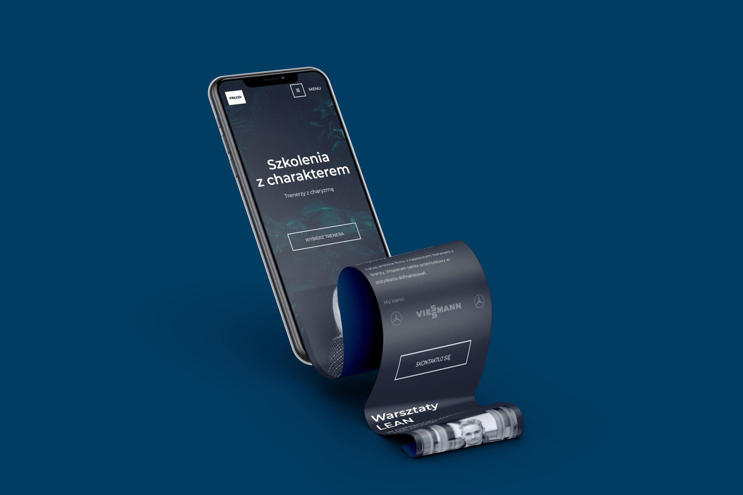
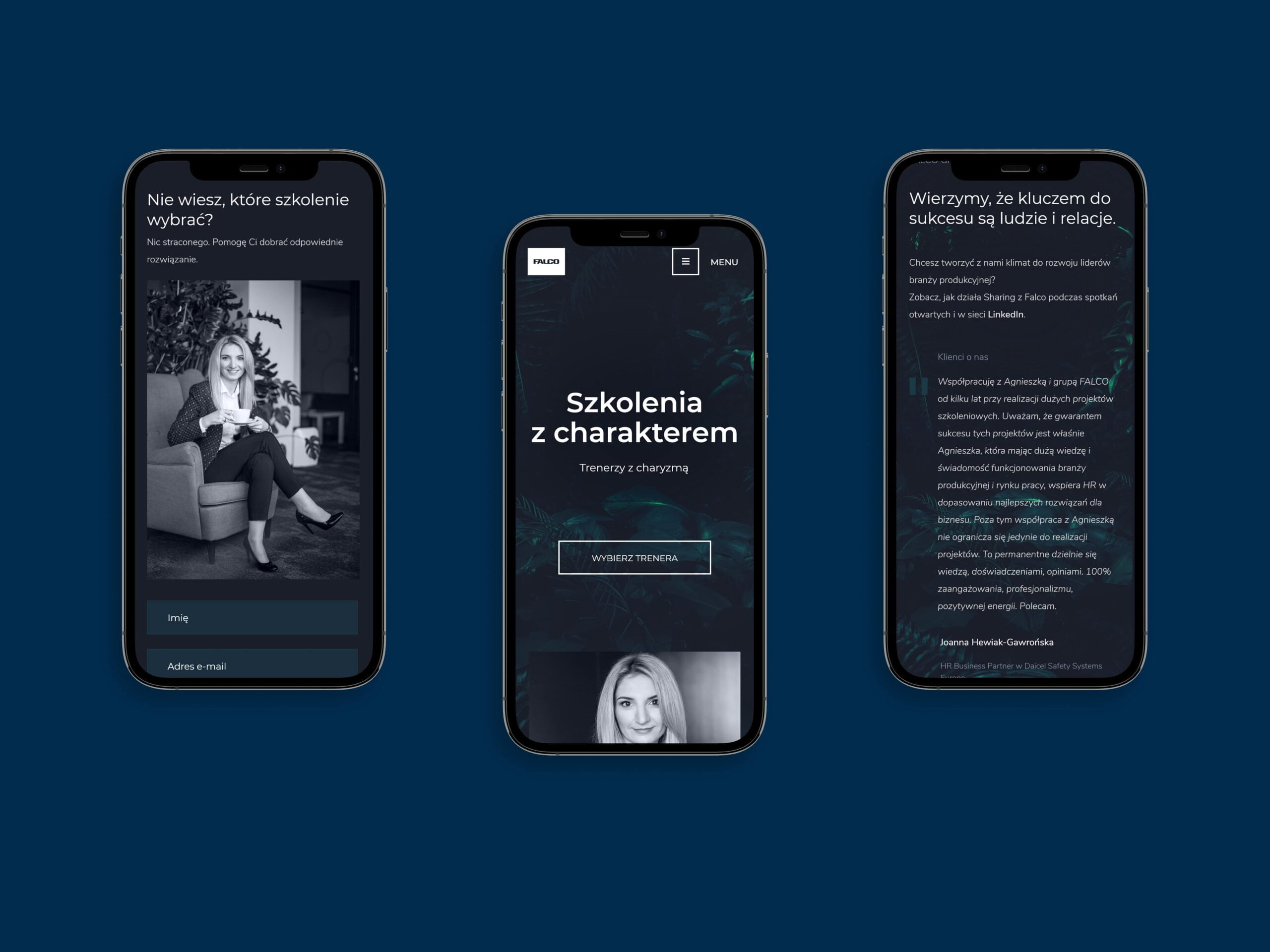
In the jungle of trainings and trainers – Falco new corporate website
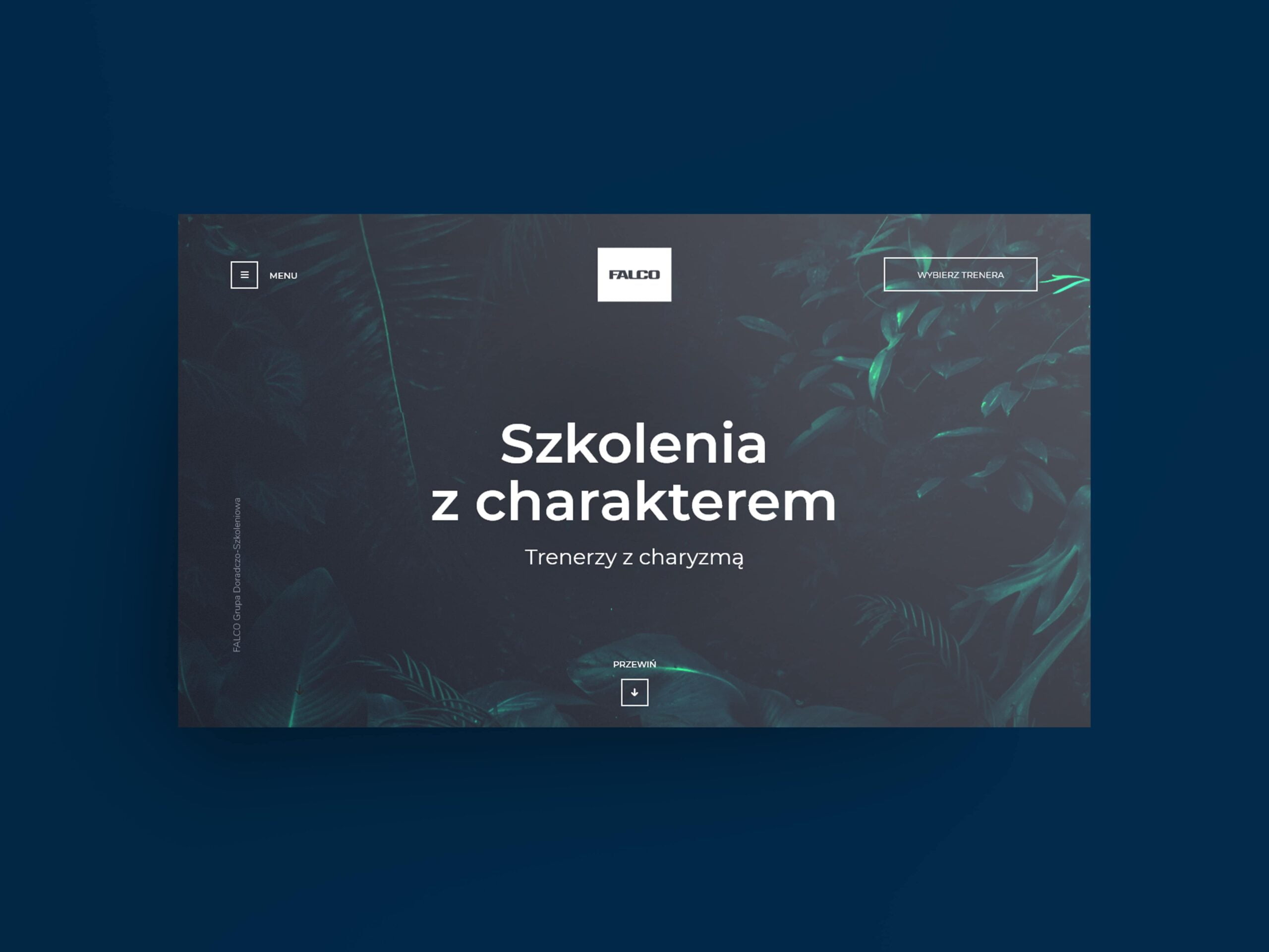
A consulting group – Falco – gained an elegant website, rich with photos, and presenting profiles of extraordinary trainers, as well as a broad portfolio of clients.
- It feels comfortable to use the website on any type of devices – from panoramic desktop to mobile phones – due to the RWD approach and meticulously designed mobile version.
- Distinguished color of smoky green adds to website’s elegance and shows Falco as a trusted guide in the jungle of industry trainings.
- Subtle animations add to the site’s fluent movement and emphasize key communication elements.
- A modern online shop is available form the menu and marked with a contrast color, so it’s difficult to ignore it 🙂
- The user can choose a particular training or answer a few questions to be advised on the most suitable trainings from the portfolio.
- A training info card displays not only the benefits and a plan of a training, but also refers to additional resources such as relevant blog posts. This way, it’s possible to get oneself familiar with the subject of the training.
- WordPress CMS enriched with advanced custom fields (ACF) give Falco full control of the website content.
From Wise People we received a lot of creative ideas and full care at the initial stage after the implementation of the site. With a clear conscience, we recommend Wise People as a reliable business partner and website contractor.
Marcin Szymański, Managing Partner FALCO
