What did the client lack?
The Challenge
When we started working with PRO Civitas the market was full of post-secondary schools. The problem was, most of them had old-school and shabby websites. Our Client’s website also didn’t follow contemporary trends. On top of that, it was built on Joomla – a niche and rarely used CMS engine.
Designing the website in its new shape, we had to take into account a massive amount of content to place. Therefore, one of the goals was to ensure seamless navigation for contact manages. WordPress was a perfect match.
We had to structure the content in a way to make users easily navigate and find relevant information. Because the old website overloaded visitors with content, a separate challenge was to convert visitors to trainees by encouraging them to fill in recruitment forms.
The goals and perspective at the start of the project:
- A modern look evoking trust at first glance.
- Usability both for the visitors and contact managers.
- Integration of contact forms with client’s CRM.
What turned out a technical challenge what the integration with an external system that collected data from multiple recruitment forms. Even so, we nailed it!
How did we crack the nut?
The Approach
With no reference point on the market, we had to use the fact that PRO Civitas is a very conscious and informed client. From the very beginning, they were convinced that their website needs to be user-friendly for visitors and content managers.
So far our client’s site (as well as the websites of their competitors) displayed a lack of UX best practices. That’s why we focused on usability.
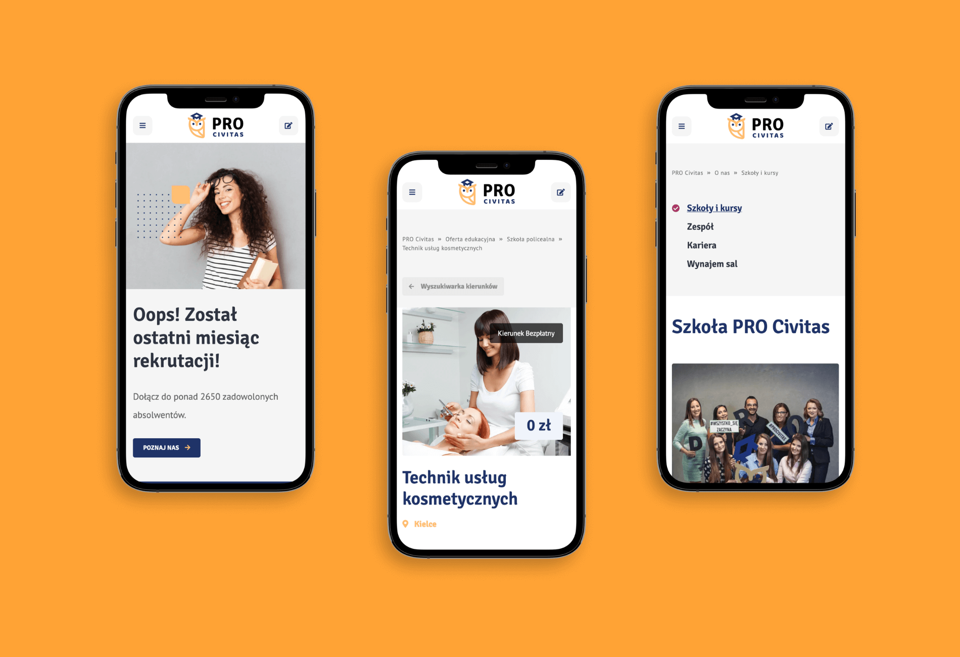
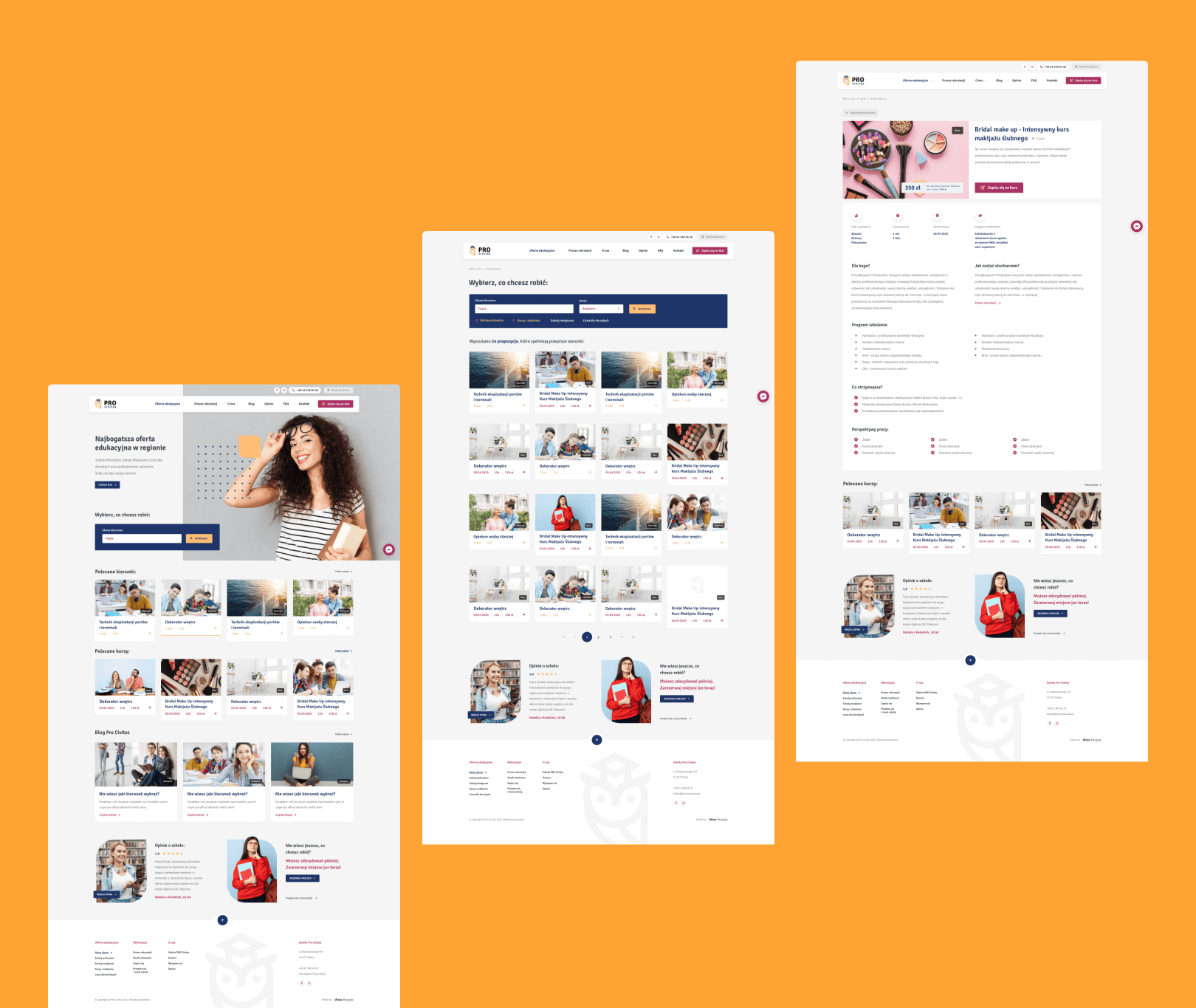
We started our work by designing a new logo and then moved to the layout of all unique subpages – separately for desktops and mobile devices.
There was no fixed meeting schedule however, we met whenever our team expressed the need. Most of our meetings took place in the design phase.
Before we built a clickable website mockup, we designed the skeleton in Adobe XD. It helped the client understand our ideas and helped us deal with change requests much faster and easier.
The project went through four phases:
- Analysis of competition as well as client’s and users’ needs.
- Design of new logo accompanied by new consistent promotional resources – based on mood boards and wireframes (both products of workshops).
- Development, tests, changes, and aesthetic alterations such as a different way to display thumbnails of blog posts.
- Transfer of the new website from the test to the production server.
The client still uses our support since the launch. Our designers and developers consult new solutions, create new or modify existing subpages.
PRO Civitas about our cooperation

Konrad Bednarski
CMO, Pro Civitas
Cooperation was professional and focused on my company goals. From the beginning of the rebranding of my company, a dedicated Project Manager, and a team of specialists were assigned and they did an amazing job!
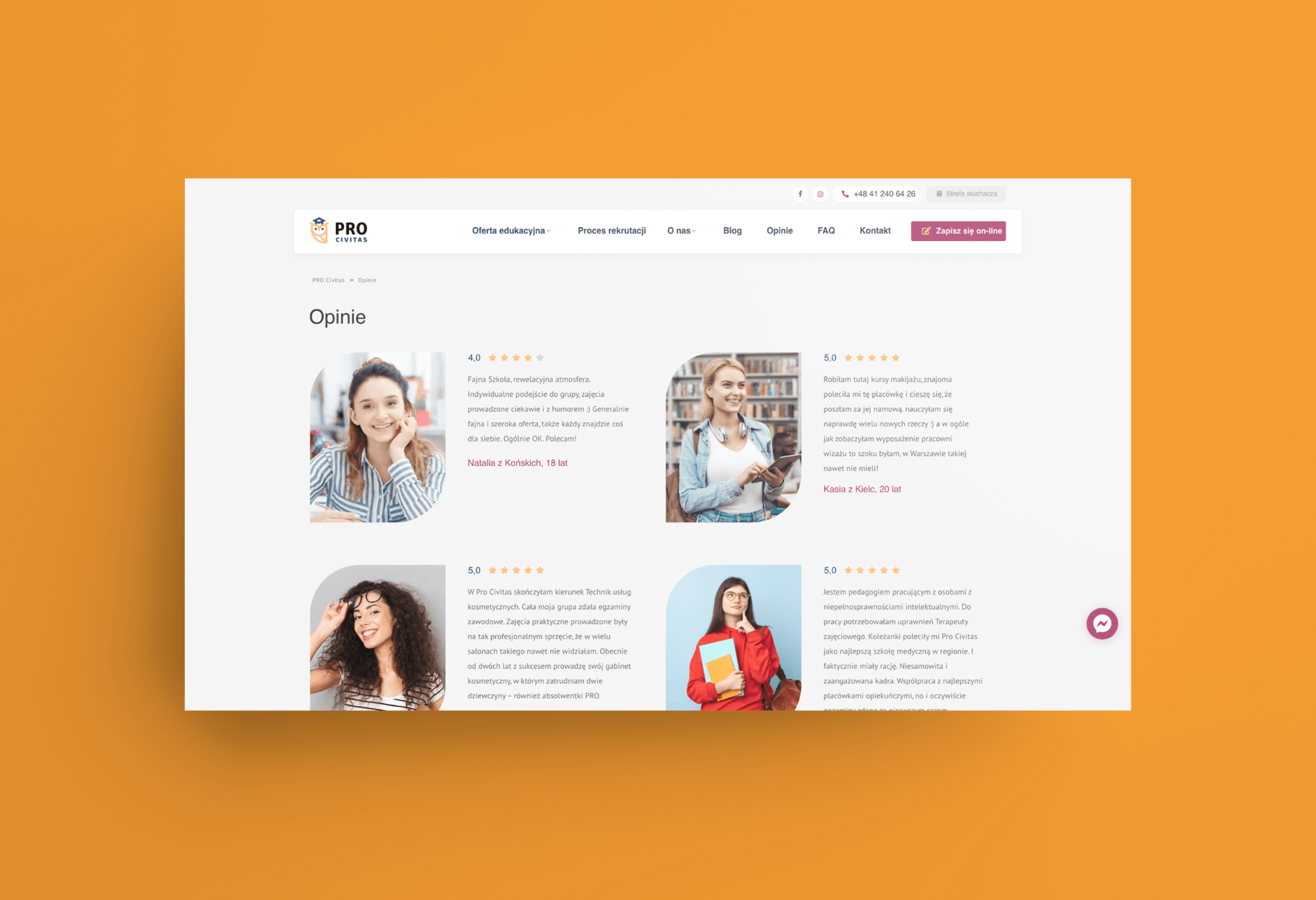
PRO Civitas came into existence to set new standards in professional post-secondary courses. Now their website reflects the company’s mission and looks as professional as their services.
What we accomplished for PRO Civitas:
- New logo and consistent brand visuals, including advertorials.
- Modern, functional website, in line with trends.
- Integration between client’s CRM and website forms.
- Unique design (powered by WordPress engine) – prepared form beginning to end by Wise People.
- A search bar on the main page. It encourages the user to write a keyword related to the course they are interested in.
- – Advanced Custom Fields (ACF) that represents the site elements as blocks, which makes it easy for non-technical users to manage content without the fear of changing the layout by mistake.
