WHERE DID IT HURT MOST?
Challenges of a grown-up IT company
Savangard is a long operating and extremely experienced IT company.
But as it often is with a broad portfolio, taming it into a logical, consistent, and readable structure, became more and more difficult with time. What hurt from this situation was sales, because the old website wasn’t bringing them an expected number of leads.
The board realized that their old website does not communicate the company’s offering clearly enough. What’s more, the offering was considered unclear since Savangard enriched it with their own products aimed at the fintech industry – a brand new segment of clients.
The challenge we faced was to design the new Savangard website that:
- Showcases services and products in a clear and concise way.
- Leaves no doubt about Savangard offering.
- Supports sales, because it takes users by the hand and encourages them to fill the contact form.
- Brings together the communication towards a mature business client and vibrant fintech startups.
- Shows how rich and non-trivial Savangard experience is, and by uncovering the team behind the company, opens the door to building a strong employer branding.
We dived into the project with an ambitious task to clarify the structure of information, build a hypnotic visual identity, and fulfill the appetite of two allegedly distant client segments.
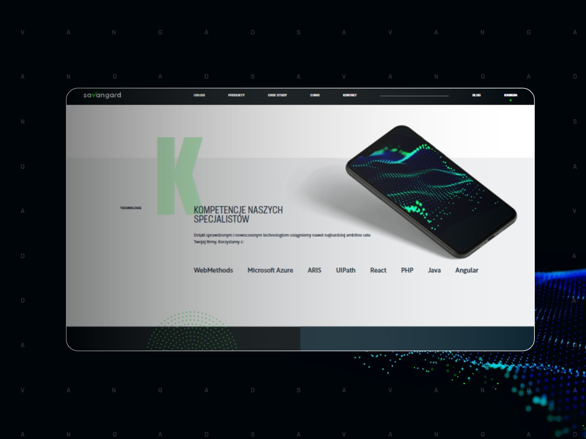
The visual side was to pair with intuitive navigation and aesthetics that show that experienced tech companies don’t have to wear conservative blue. On top of that, it was to bring together the expectations of innovative fintech companies and enterprises that value experience and stability.
HOW DID WE CRACK THE NUT
The Approach
Due to its complexity, the project demanded a methodical approach and work out of Savangard’s fundamental brand values. One of them, and at the same time a key feature of the website, was a thought-through and automatic lead generation mechanism.
Brief – much more than a plain contact form
Too long and complex contact forms can easily scare potential Clients to the point when they drop the idea of getting in touch. Savangard has a rich and complex offering, which is why we decided to mitigate the risk of abandoned forms. We created something different – an interactive brief.
Brief is an intelligent contact system – meticulously fitted to the most common queries. How does it work?
- We direct users straight to the right step of the brief. How do we know which one is the right one? We check which product or servic page generated the brief. This way, the users fill in information directly connected with the service or product they were interested in.
- The brief prompts what users can expect and what are their options. Meaning – the brief takes users by the hand and inspires confidence, which turns into higher ratio of fully filled forms.
- The construction of questions helps Savangard sales team assess the support the lead might need. Thank to that, the lead is contacted by matter experts responsible for the right category of products or services.
The clarity of the brief gives users a distinct information of what they can expect from Savangard. Such clarity inspires confidence and trust.
The concept and UX were built on the basis of Wise People creative process which in the case of Savangard website covered the following phases.
- We started with a Design Thinking workshop during which we long discussed Savangard goals, challenges, clients segments, and values the company was driven by.
- A thorough analysis of th workshop helped us propose a simplified architecture of information. We also prepared a moodboard, which is a table with inspirations coming from brands that fulfilled Savangard objectives. Thanks to the moodboard the Client could visualize the graphical direction of their project.
- Next, we prepared two visual proposals of the main page, out of which the Client chose one. It became the aesthetics for the entire project.
- Regular and frequent communication with the Client encouraged timely reactions on both ends. Strong engagement of the Client’s team throughout the project turned into a good partnership, and friendly atmosphere – great environment to work in.
The design and development phased overlapped. We designed following components and subpages, and passed them for development right after the Client accepted them. This way Savangard could launch the new face of thor website faster, and also adjust its shape to their current needs.
Results for Savangard website
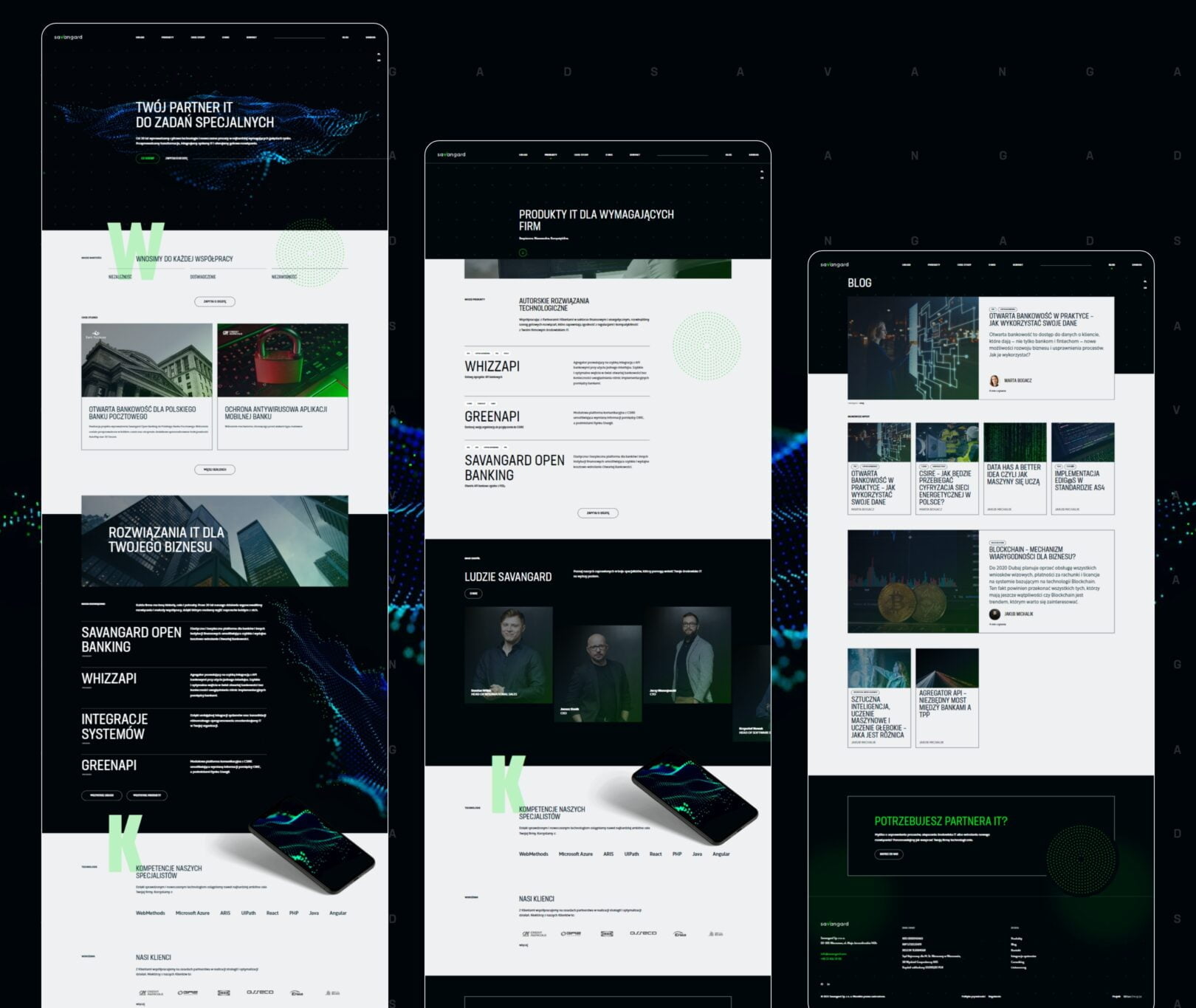
New Savangard website is a mine of contemporary solutions, when it comes to both design, and functionality.
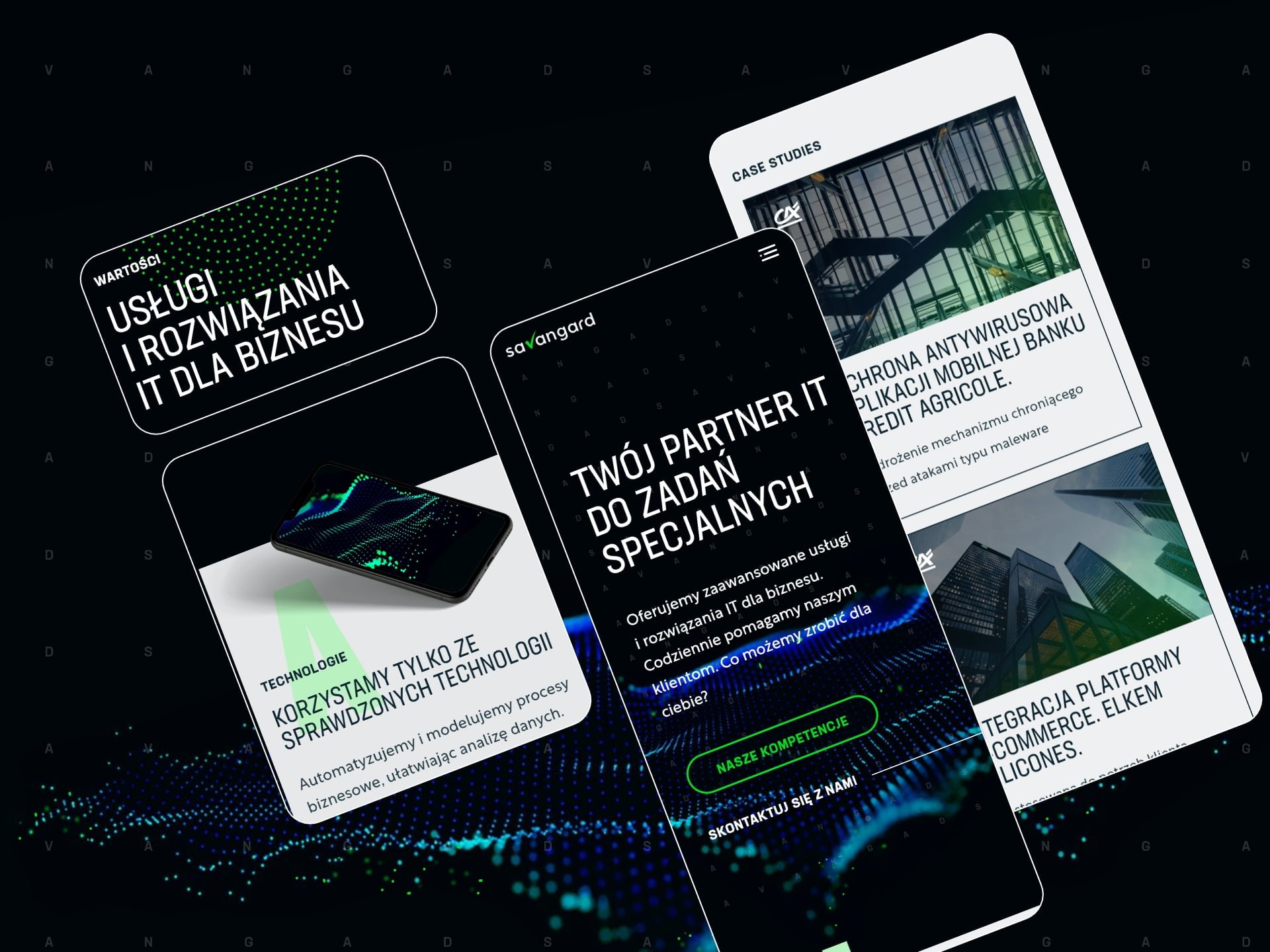
- Classic black composed with neon green gives the site an energetic vibe and adds to its contemporary feeling. A repetitive motive of a dotted circle consequently shows that each side is a part of something bigger.
- Advanced API products for banking industry gain their place in the menu, which clearly shows that Savangard is more than just consulting an IT integrations.
- Animations on the main page bring to mind advanced technology of artificial intelligence, and thus they show a progressive character of the company and its offering.
- A dedicated contact brief (CTA) is a natural way of leading users through the phase of sending a project request.
- Brief lets Savangard segment the clients by the industry and topic of the conversation, which allows for better and swifter service.
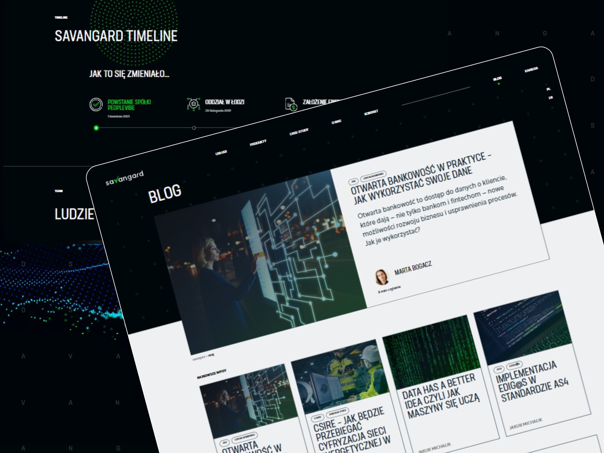
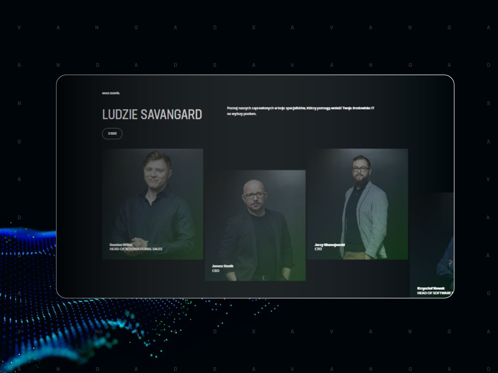
- The exposition of tem pictures shows that Savangard is proud of their employees. It has a significant meaning to the HR function the website fulfills.
- Building a dedicated integration of displayed job offers with an external HR system – Traffit – allows for a comfortable adding and managing all offers from one place.