IT’S… COMPLICATED
Difficult things can be difficult to tell
Leonardo Da Vinci used to say that simplicity is the ultimate sophistication. This idea also guides startups when they write software. However, it often happens that while technology companies can provide interesting and advanced programming solutions, explaining them in a simple and attractive form is another story. When we first met Authenteq representatives, this was the problem they were facing.
Authenteq is a startup with a brilliant product that democratizes the use of advanced facial recognition technology, which until recently was used mainly in the fintech sector. The KYC (Know Your Customer) procedure has for years obliged banks and financial institutions to exercise due diligence in authenticating users in order to prevent crime and fraud (Anti Money Laundring, AML). Previously available only to large entities, thanks to fintechs KYC can be used commercially, as evidenced by Authenteq.
The thing is that despite the technologically refined product, the company was unable to reach its target groups in a simple and effective way.
When the client approached us with a proposal to build their new website, we knew that it would serve two purposes:
- Business purpose, i.e. increasing the conversion understood as the number of product inquiries, demo requests and access to technical documentation.
- Branding purpose, i.e. building a website that is attractive to the market and presents the product in a reliable way, and at the same time is fresh, light and pleasant for users.
We knew that both goals would be equally important, and the key to their implementation would be customer service at every stage of the purchasing cycle – from the first contact with the brand to providing arguments for purchase, presentation of price lists, as well as handling the purchase itself from the website level.
HOW TO HANDLE THE PROCESS OF CREATING A WEBSITE? WE HAVE A WAY TO DO IT.
Conversion building machine
The key to converting product pages is an effective CTA (Call To Action), the strength of which is matching to a recognized group of recipients.
If there is more than one group (as in the case of Authenteq), separate CTA functions should be designed for each of them.
In addition, each group should find content and sales messages addressed to it on the website, which together form a comprehensive picture of the product. Paradoxically, the simpler the product, the more challenging it is to show it from different angles, pushing users towards sales.
So how to create the right structure, saturate it with content and CTA? The secret lies in solid preparation, which at Wise People begins with workshops with the client.
- The Discovery Workshop is a meeting lasting several hours, and in some cases even two days. In the case of Authenteq, it is almost a forum on several continents and in four time zones. The workshops were attended by participants from all over the world (Germany, Poland, USA, Canada and Japan), which in itself was a considerable logistical challenge. We discussed the client’s situation, needs, and expectations. We also spent a lot of time to discover who is the recipient of the product and to whom the website should be addressed. On the basis of the workshop, a map of services and values was created, which guided us during further work.
- Based on the conclusions of the workshop, we built a sitemap with the aim to:
- reflect all customer paths, i.e. design how the user is to navigate the website, depending on whether he is a programmer, manager in a startup or an investor,
- choose contact channels for the visitors and distinguish the narrative depending on which persona we would be addressing,
- build the right CTA to clearly indicate to users what their next step should be,
- take into account people who are at different stages of purchasing process, with particular emphasis on the so-called cold leads,
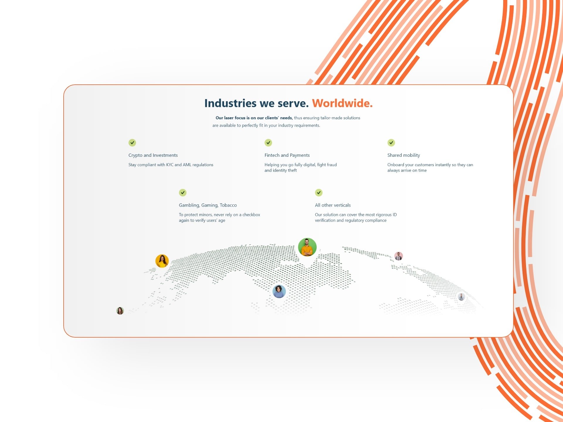
- meet the needs of all audiences. The Authenteq website was supposed to communicate with developers who could use the product’s API, with potential investors, and with companies from the fintech / gambling / retail sector, for which verification of the age of users is crucial.
- on each subpage there is a clear suggestion to take the next step / perform the desired action.
- In order to show our client visual projects in the style we propose, we have prepared a moodboard – a board with inspirations. After the client approved the style, we started designing the main website.
- We refreshed Authenteq branding. The client had their own visual identification book, in which we made the necessary corrections.
- Design for conversion. We planned a website that is alive – it is dynamic, filled with subtle animations and interacting with visitors. In order to strengthen the conversion, we have designed numerous starting points in the form of an invitation to a product demo, redirection to technical documentation or an appointment with a consultant.
- Regular and frequent communication between the Product Consultant and Designer of Wise People and the client contributed to an open discussion about the product. Thus, it made it possible to jointly develop the shape of the website, its logic and achieve business goals. Authenteq actively participated in the discussions, which translated into great partnership cooperation.
- Development and testing stage. After obtaining the approval of the graphic design and the animation concept, we went on to create a website for Authenteq. When choosing the technology, we made sure that the content was easily editable, and the creation of subsequent subpages was pleasant, thanks to the templates prepared by our team.
RESULTS VISIBLE TO THE NAKED EYE.
Technology full of life – website that sells KYC
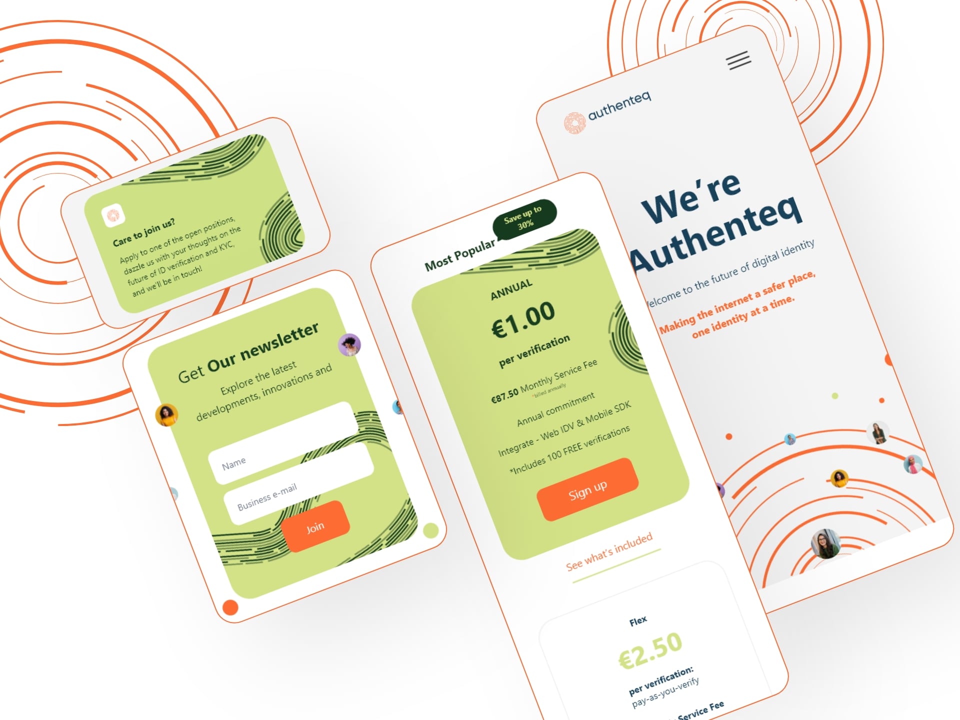
The new Authenteq is a project that we are particularly pleased with. We had the opportunity to go a bit visually crazy (which we owe to the startup character and client’s DNA), while emphasizing the importance of the website in the process of acquiring new contacts.
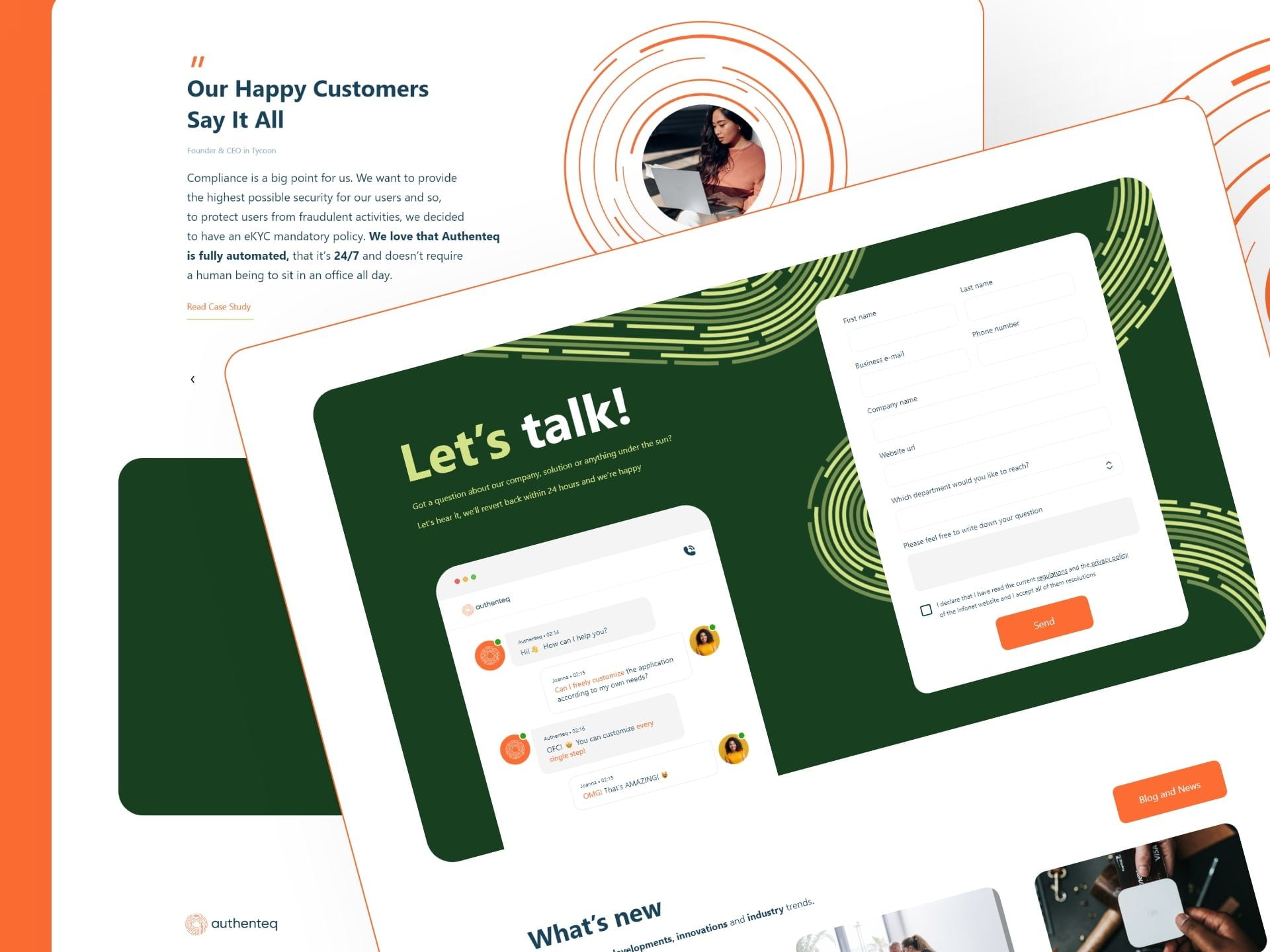
- Direct communication. A well-thought-out “above the fold” screen immediately informs the customer that he is dealing with a technological product that enables user verification in accordance with the KYC (Know Your Customer) principle.
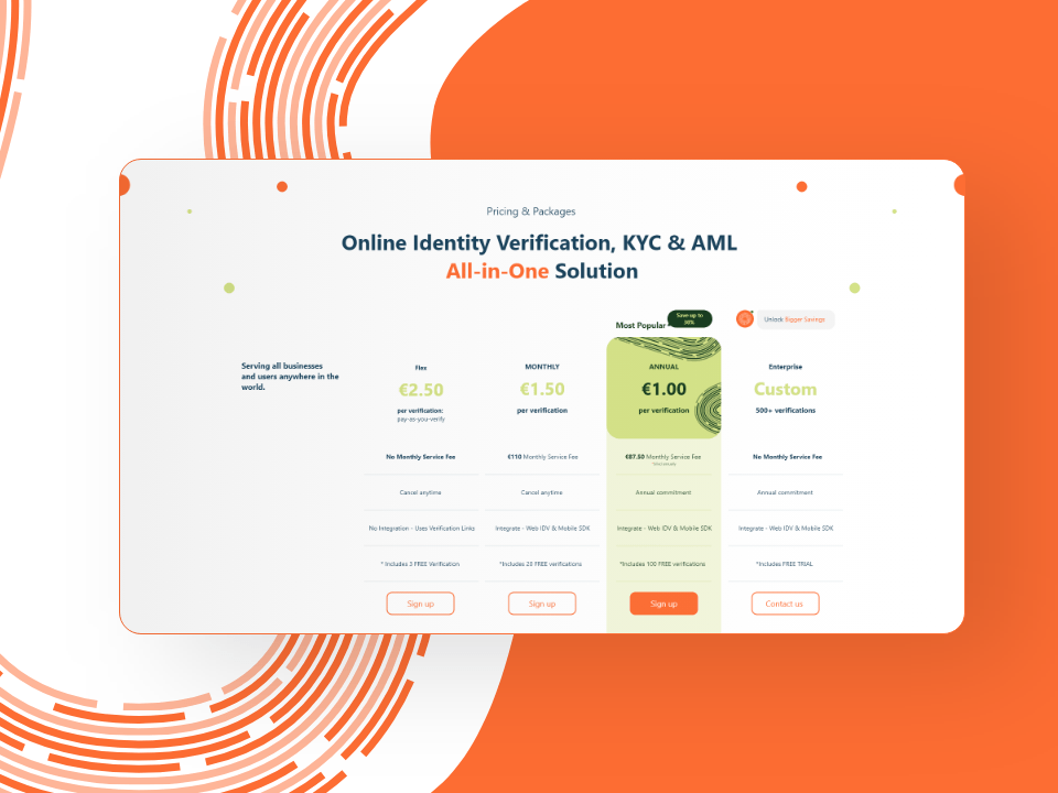
- Conversions everywhere. Well-thought-out and strategically placed calls to action push the user to planned actions:
- sign up for a product demo,
- package selection,
- contact with the company.
- In addition to the above conversions, the user can freely read the product documentation, subscribe to the newsletter or learn more about the company and its values.
- Animations and micro-animations encourage interaction, while clearly presenting the advantages of the product, suitable for each of the recipient groups. The following animations deserve special attention:
- visualization of the product’s operation, which is the heart of the header on the home page,
- moving circles and waves imitating a fingerprint and referring to identity identification,
- self writing headers,
- animations imitating a chat conversation.
- Clear information sections alternately address the needs of developers and startups, thanks to which Authenteq can keep users interested in its product for longer, both in terms of its functionality and business benefits.
- Easy access to the contact form from each subpage gives you the opportunity to quickly contact the company. It also increases trust in the company and the belief in its customer-friendly approach.